
“Above all else show the data.”
― Edward R. Tufte, The Visual Display of Quantitative Information
― Edward R. Tufte, The Visual Display of Quantitative Information
Case Study
My Role
UX/UI Designer
UX/UI Designer
Project Duration
1.5 year
1.5 year
Agile Team
Director of Marketing (Product Lead), Product Engineers, UI Designer, Full Stack Developers
Director of Marketing (Product Lead), Product Engineers, UI Designer, Full Stack Developers
Deliverable
Redesign of corporate website, SaaS, B2B
Redesign of corporate website, SaaS, B2B
Project Tasks
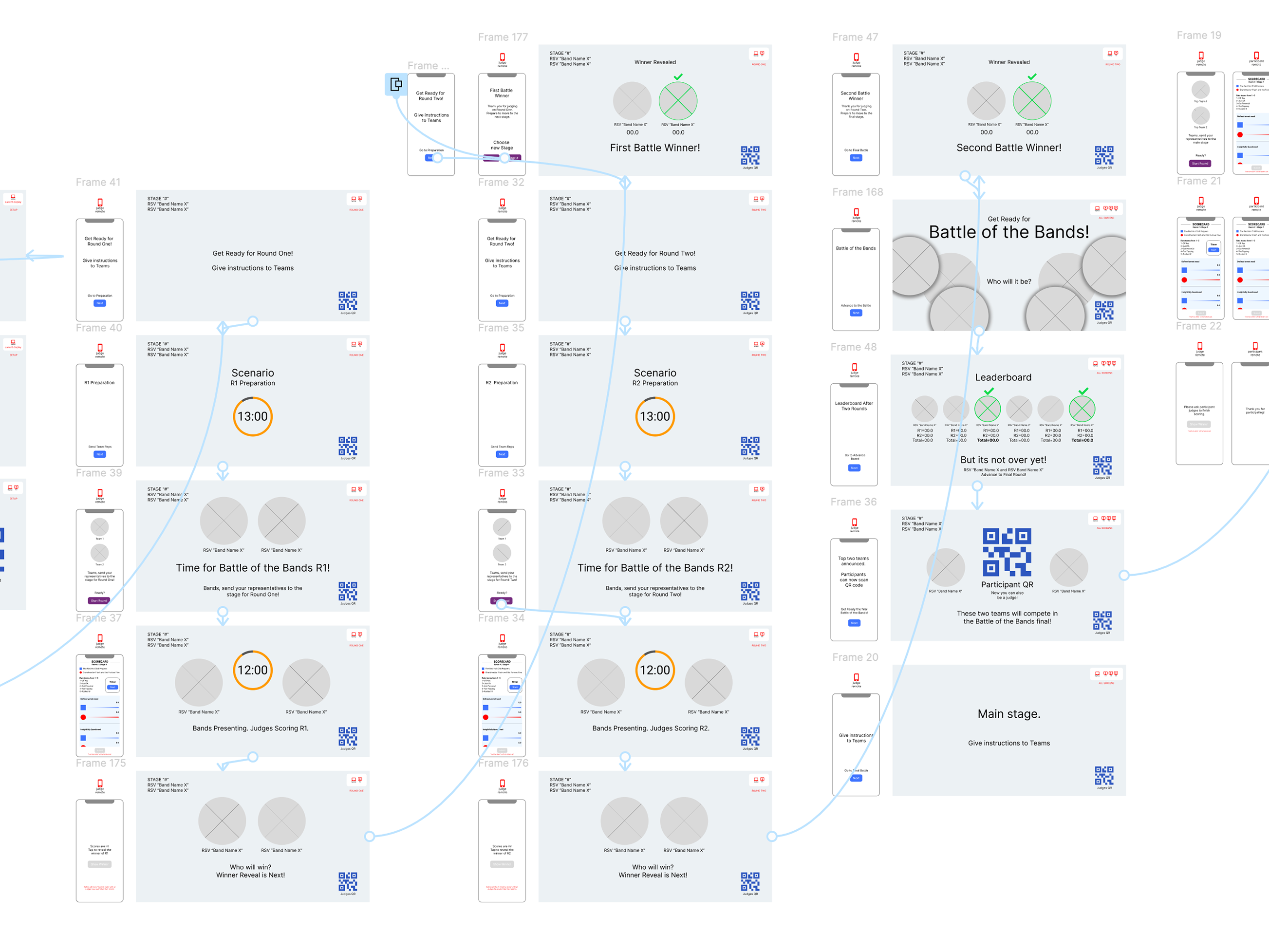
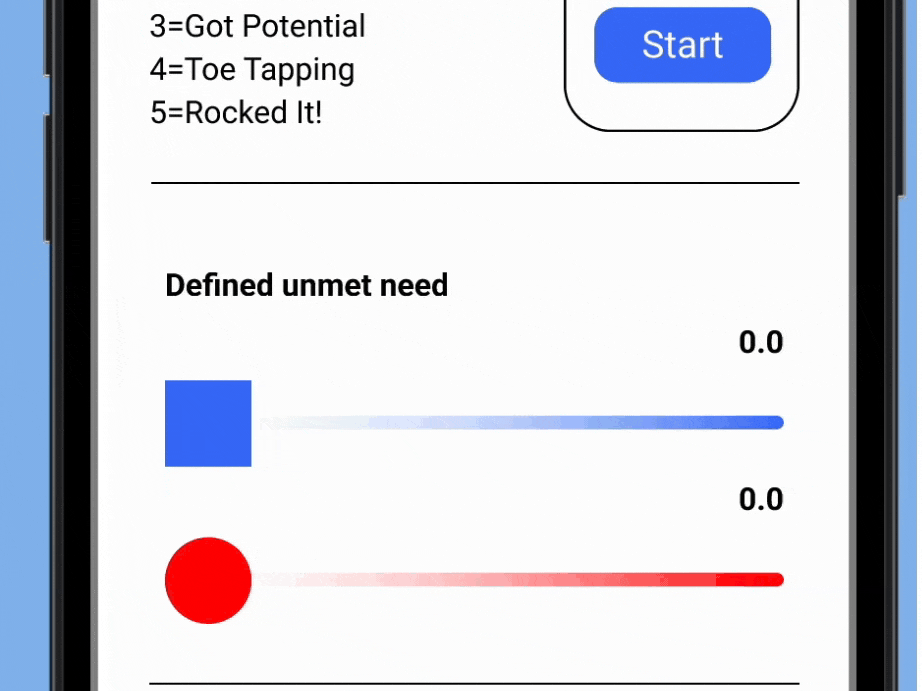
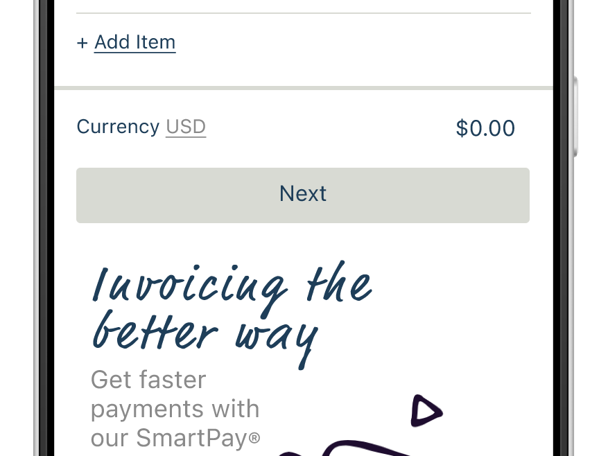
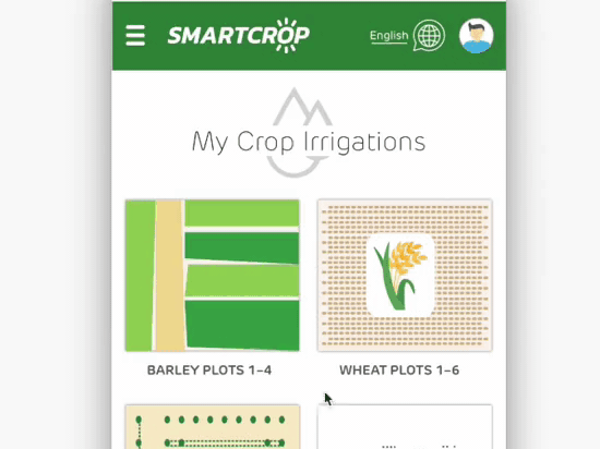
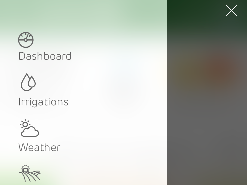
For the SaaS part of our project I worked with the product team engineers taking direct wireframe drawings and conducting interviews with them to establish the best UX path.
For the SaaS part of our project I worked with the product team engineers taking direct wireframe drawings and conducting interviews with them to establish the best UX path.
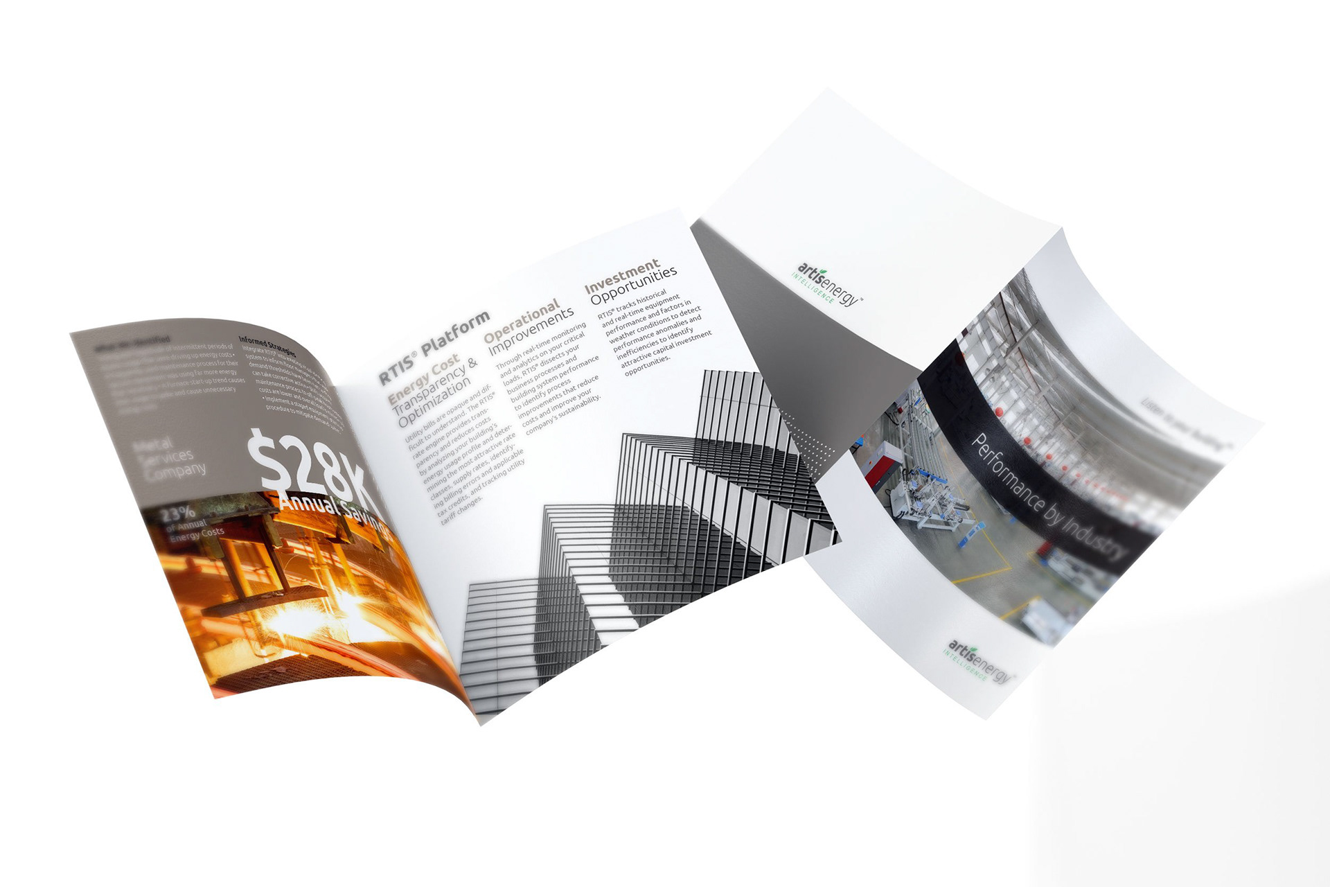
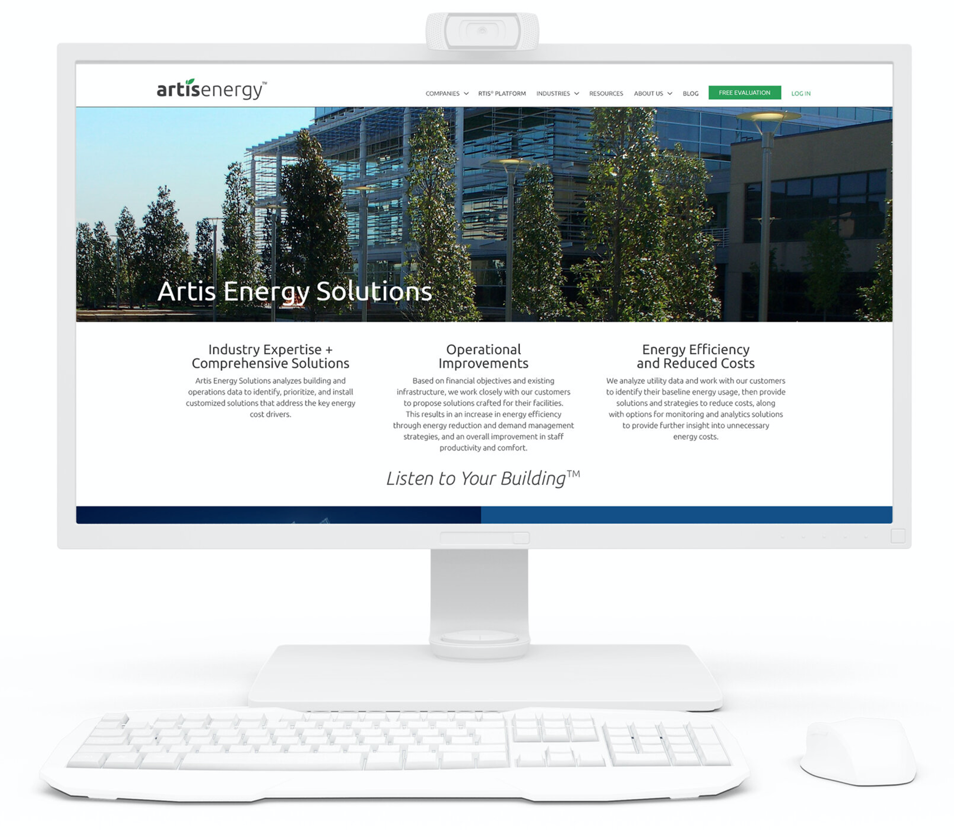
In terms of the corporate branding assignment our task was to establish a clear division in their two main companies: “Artis Energy” and “Artis Intelligence”. This needed to be achieved while maintaining a clear visual aesthetic overall. Starting with the identity mark, color palette and corporate font my main task was to come up with an updated design system. Pulling directly from new wireframes that were shared with me I iterated on all the new screens that would need to be produced by the developers.
Outcome
For the SaaS side of the project the amount of time saving that was measurable among their sales teams directly increased sales they were able to deliver. This was in large part to the clean user flows established with the engineering teams and their input as well as the head of marketing and my work to create an aesthetically smart and highly functional environment.
For the SaaS side of the project the amount of time saving that was measurable among their sales teams directly increased sales they were able to deliver. This was in large part to the clean user flows established with the engineering teams and their input as well as the head of marketing and my work to create an aesthetically smart and highly functional environment.
A fresh new dual site architecture was delivered to the main stakeholders and was received with great adulation. The feedback was very positive in the end setting them up for a new outlook for continued success. The new “sites” set out to achieve the goal of bringing together all of their core assets under one main digital roof.
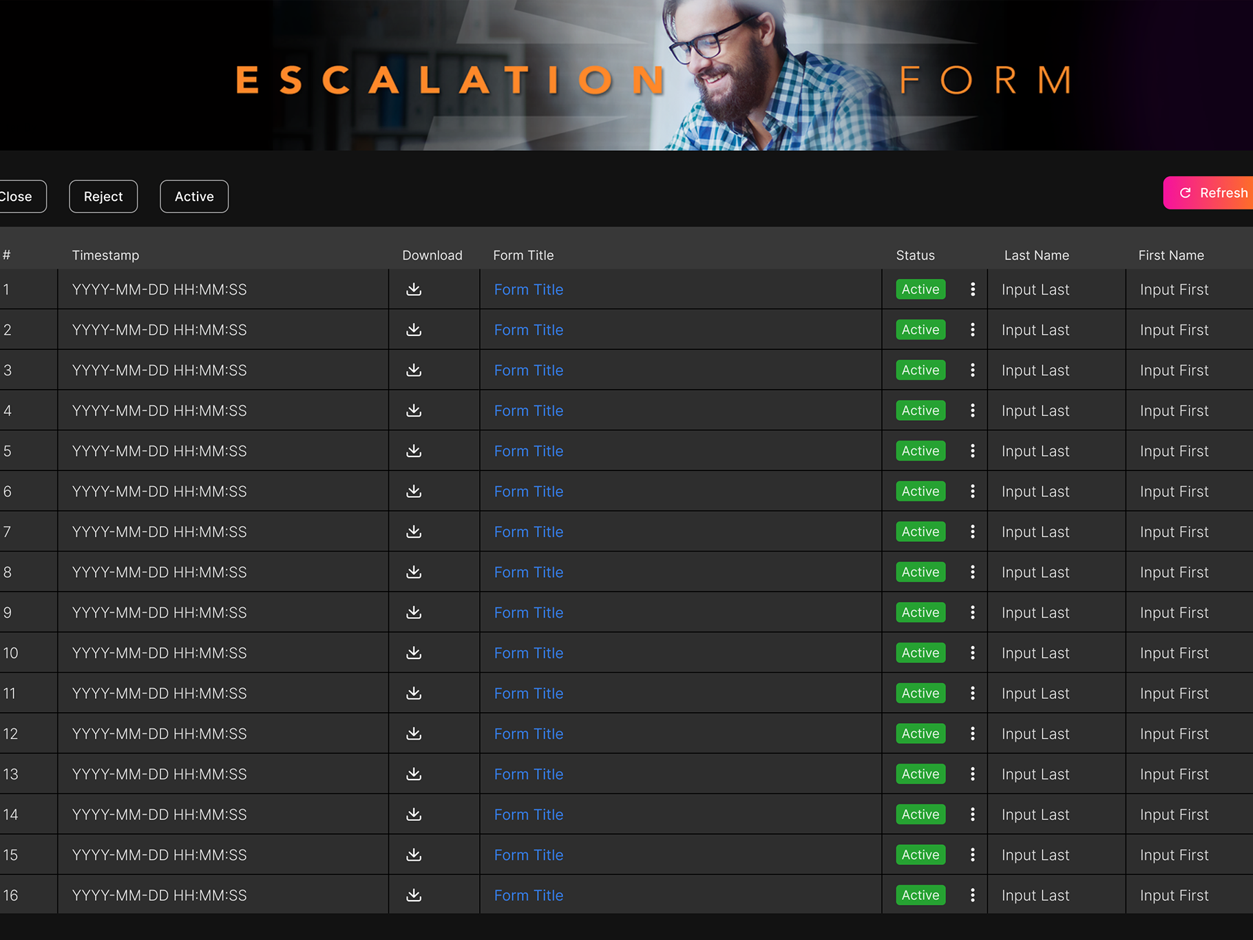
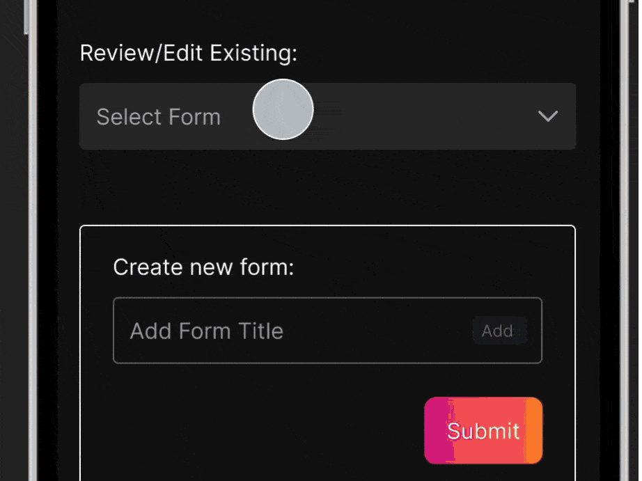
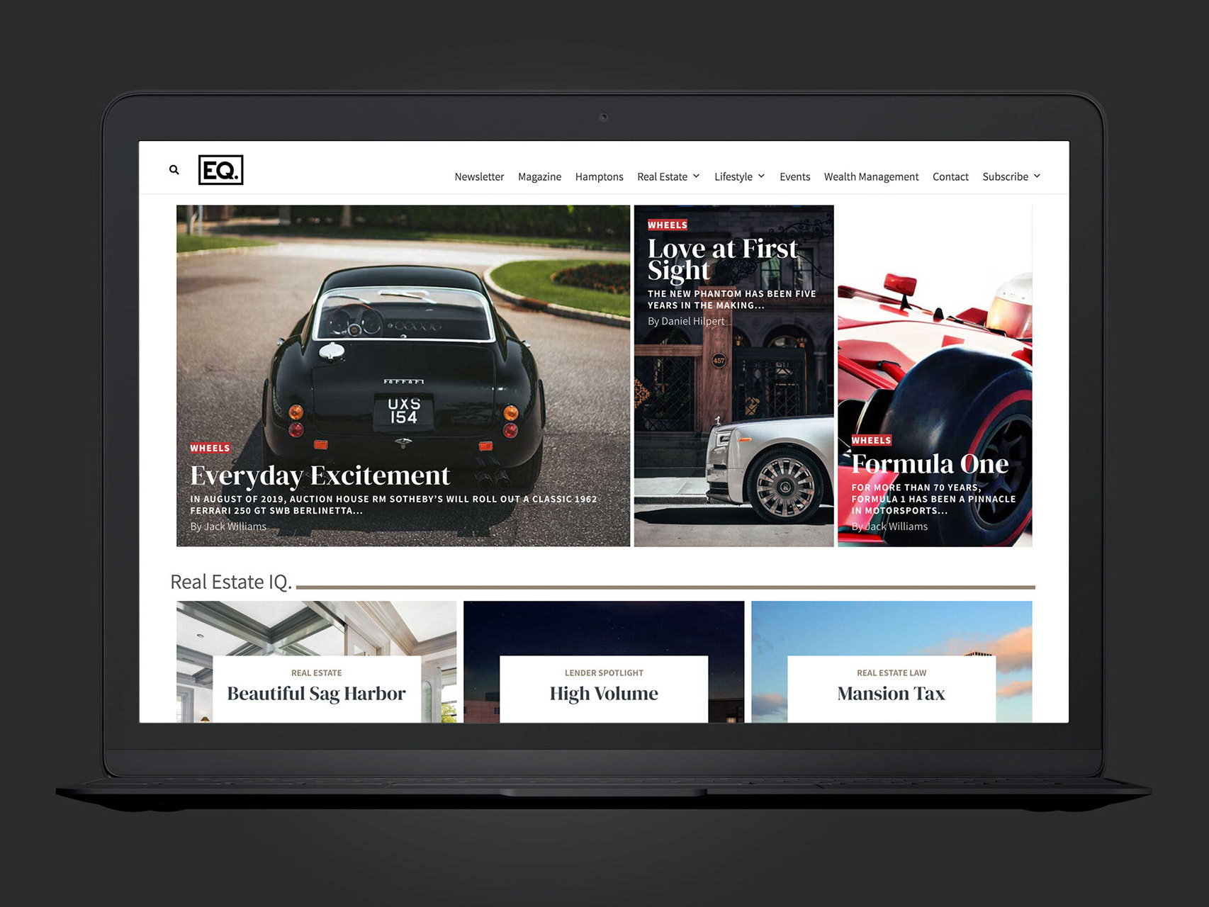
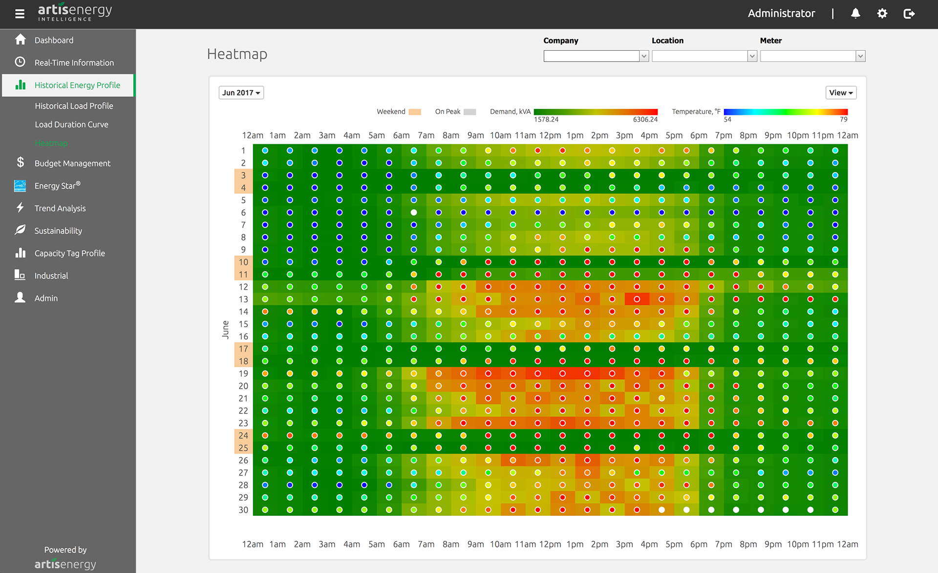
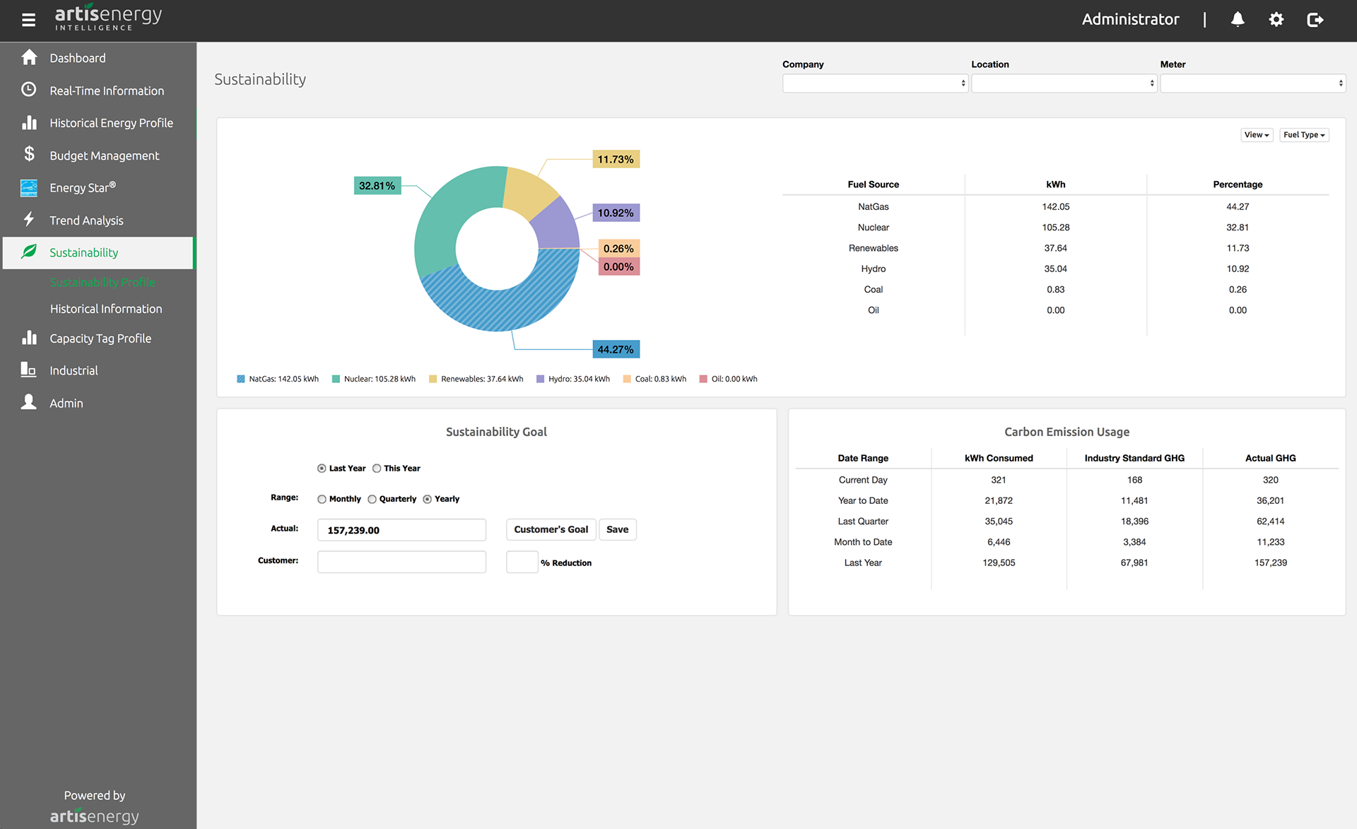
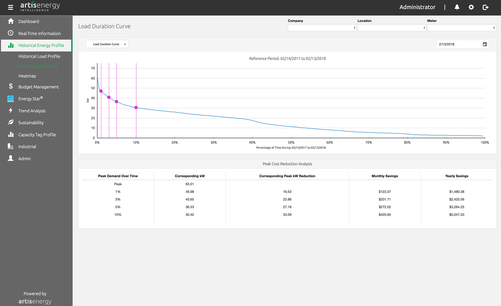
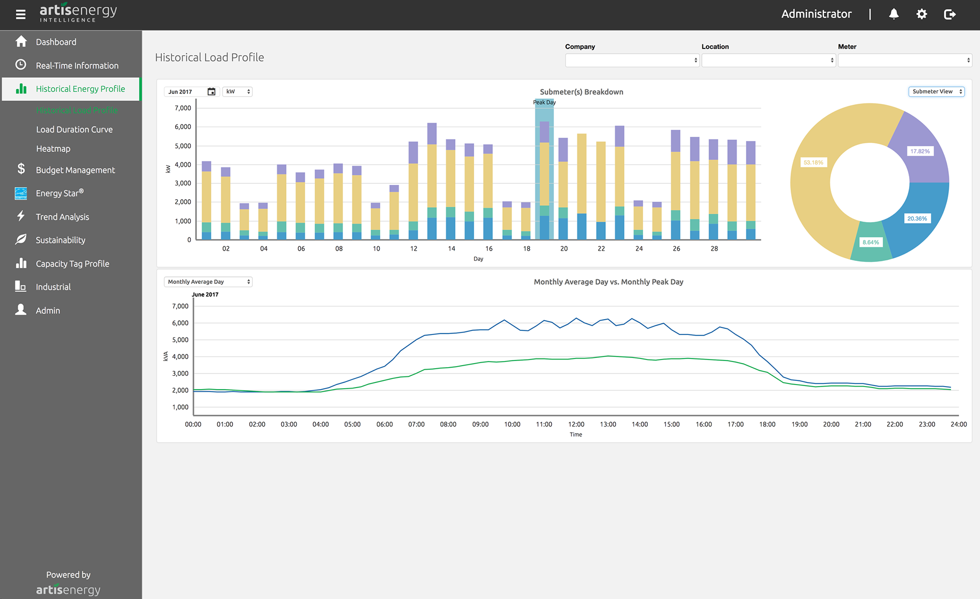
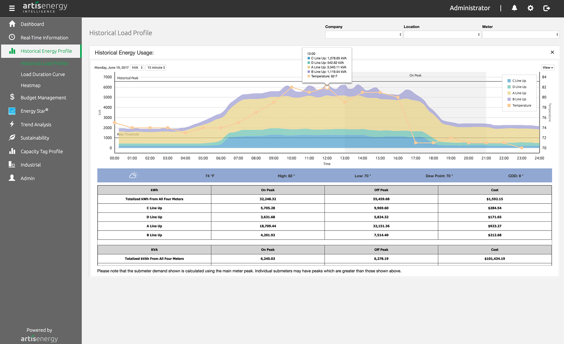
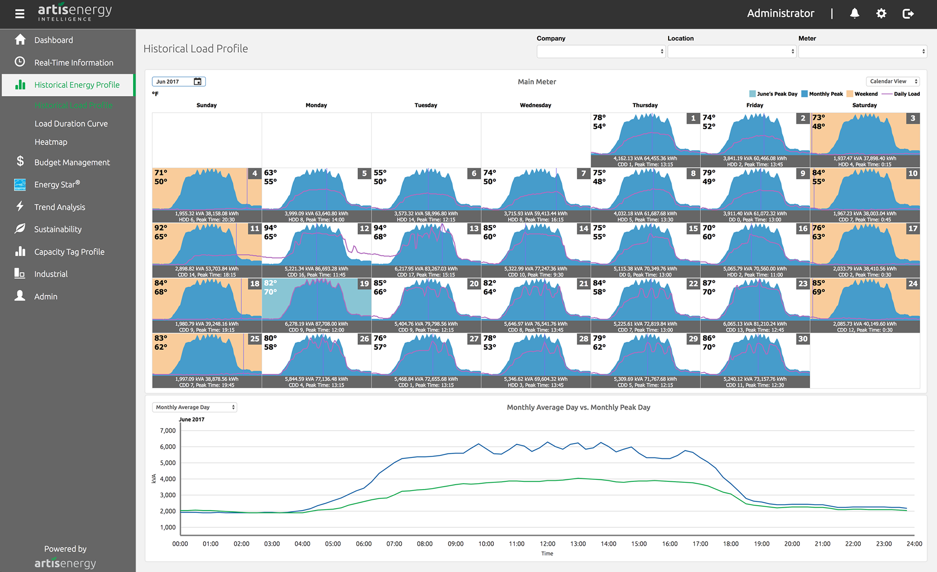
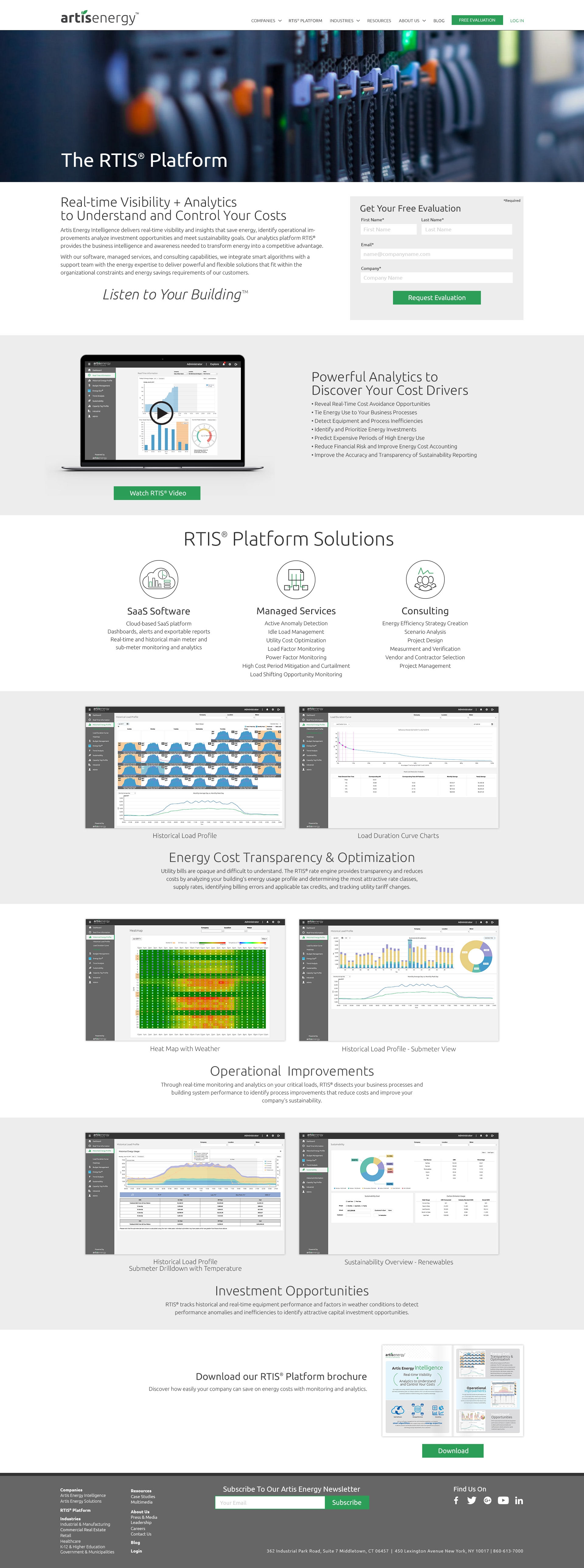
Sales Platform Dashboard
These are a series of example screens that allowed a member of the sales team to quickly pull up data or charts when pitching to potential new customers. Data represents the information from a customers database used to display potential use and energy cost savings.
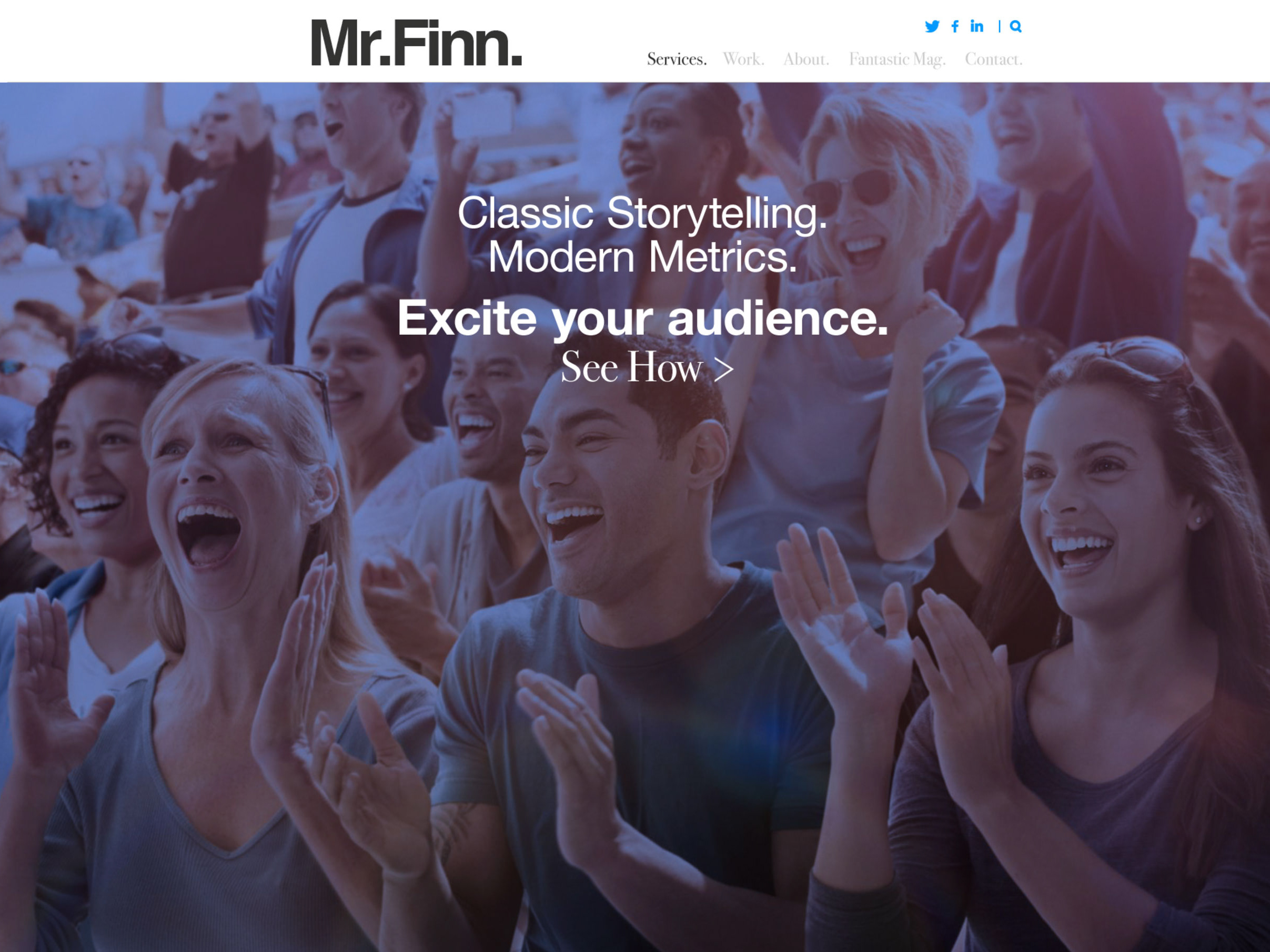
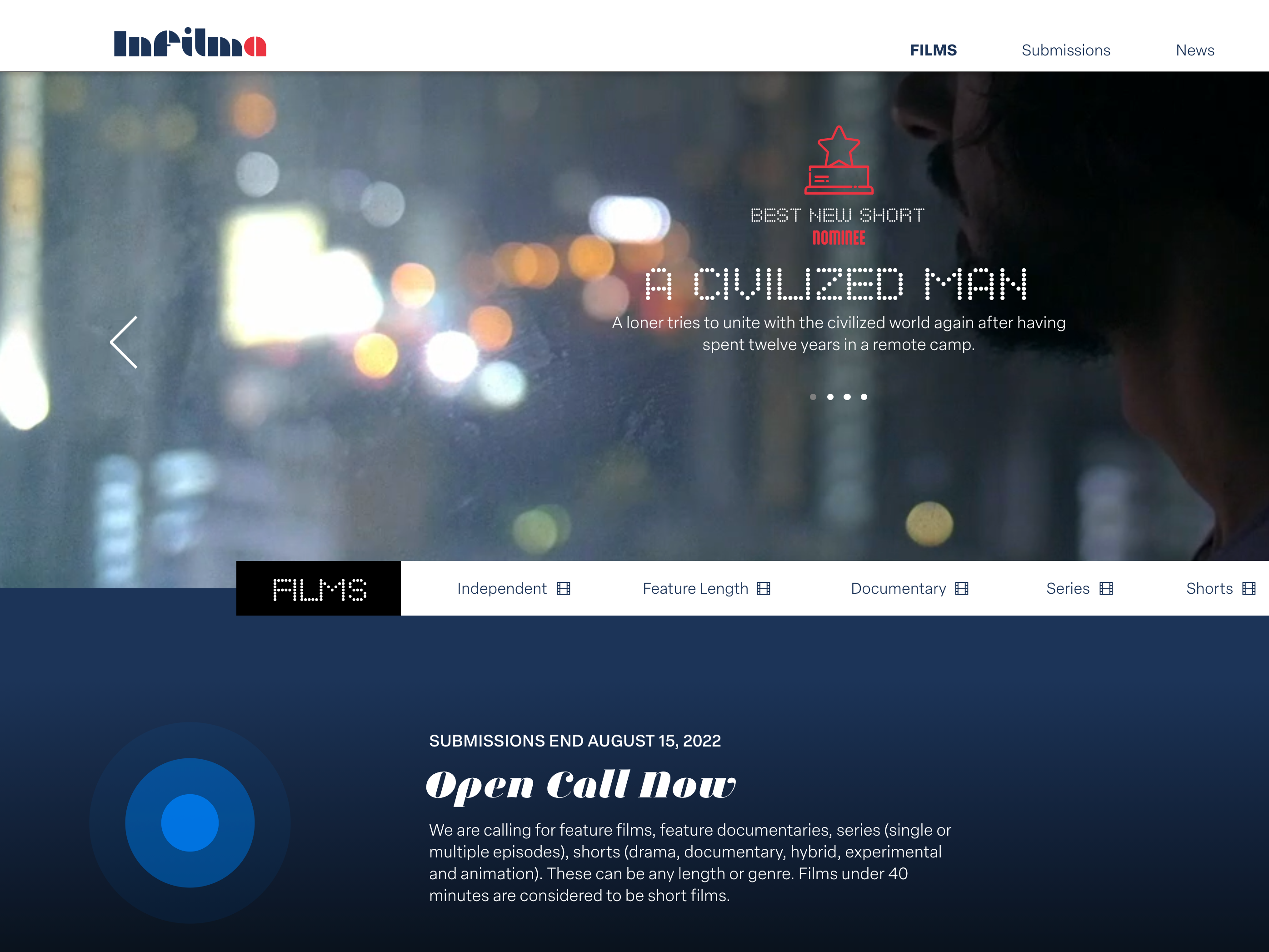
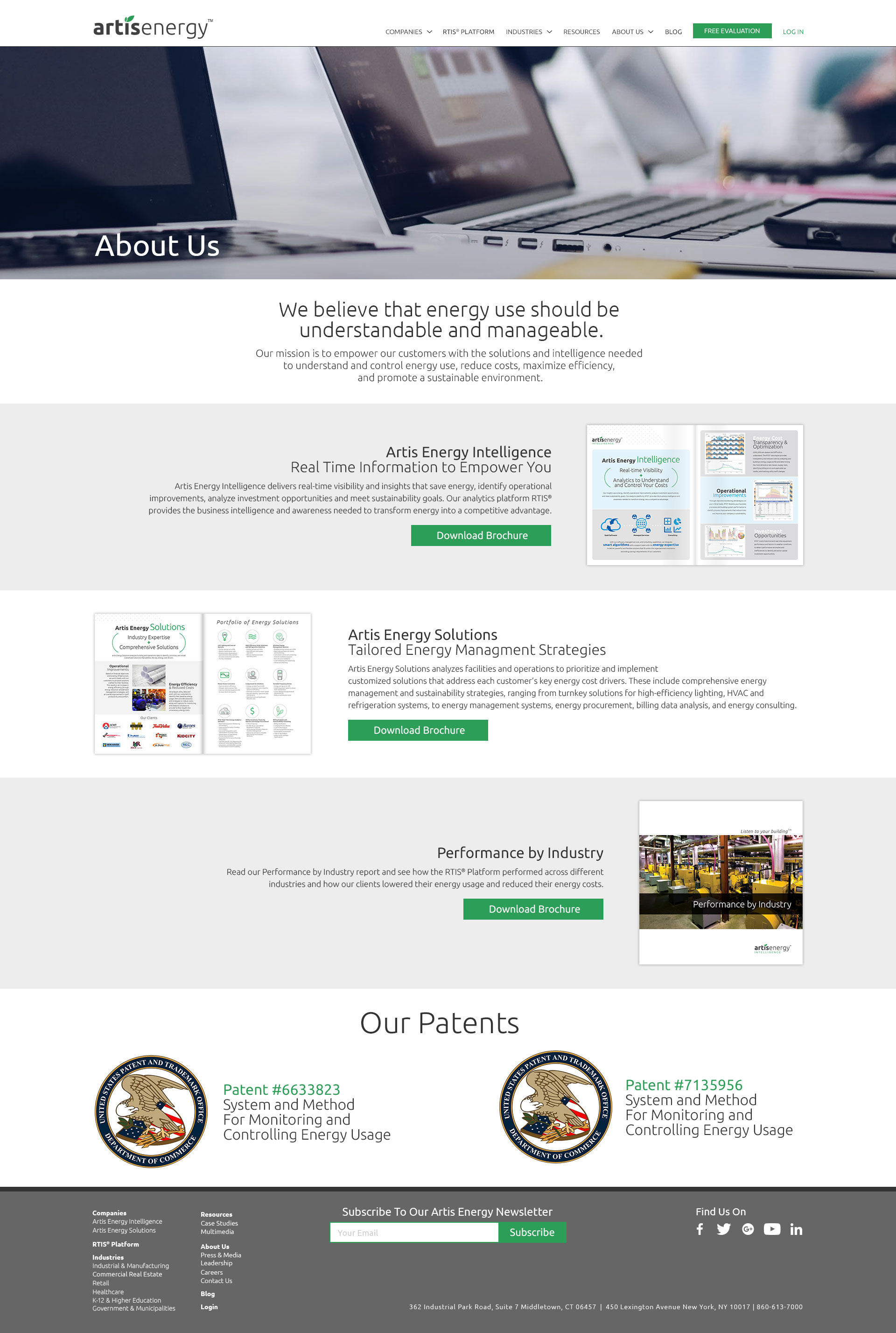
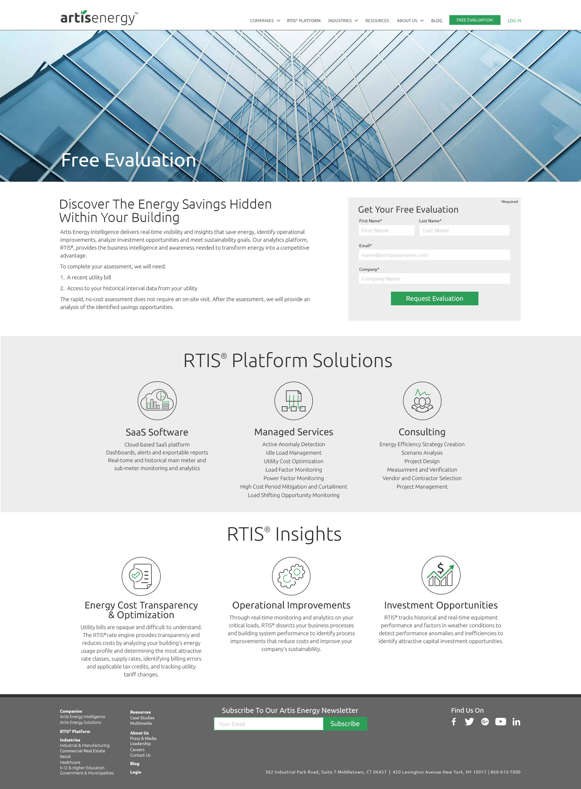
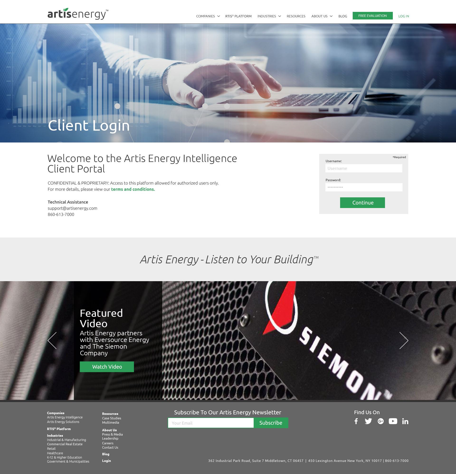
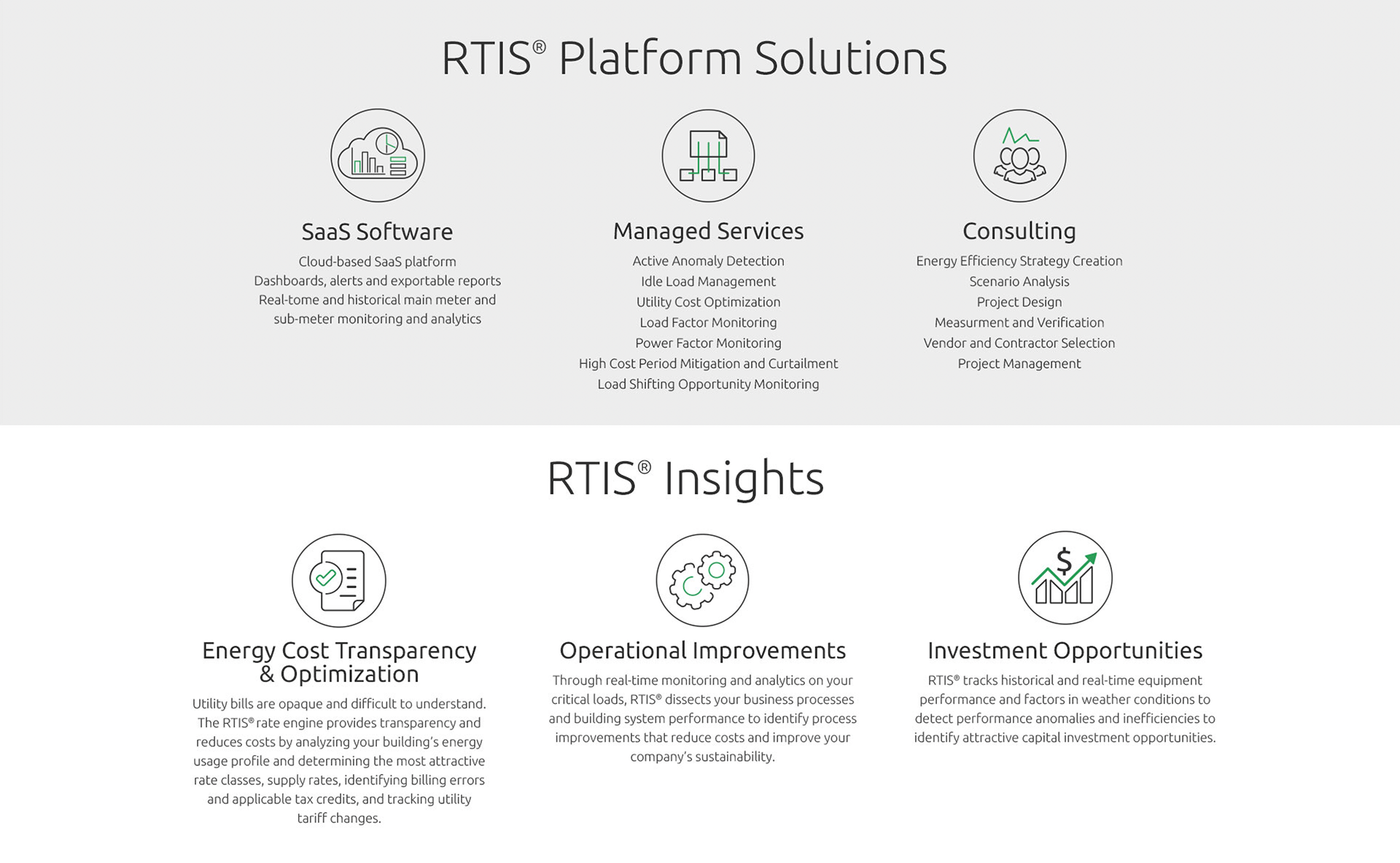
B2B corporate site
These example screens show some of the key pages on the corporate side showing important messaging and capabilities of the energy company.
Below is an iconographic design system that I created that could be called up for use from a shared “asset” library (.svg/.jpg).
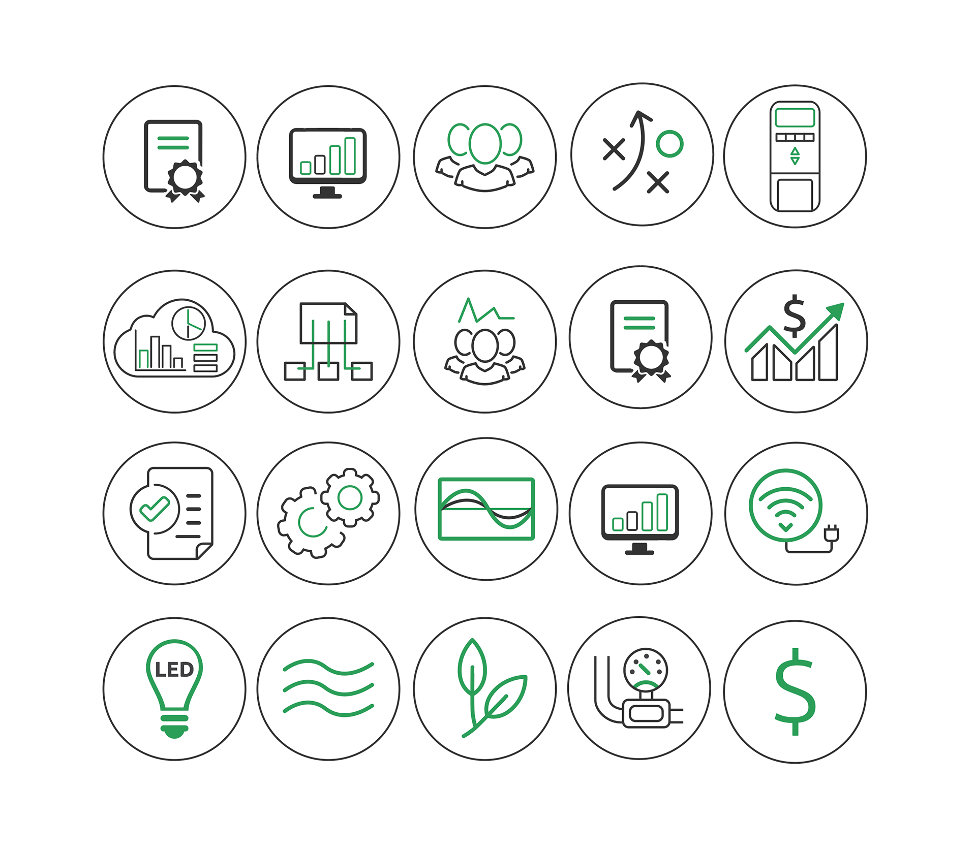
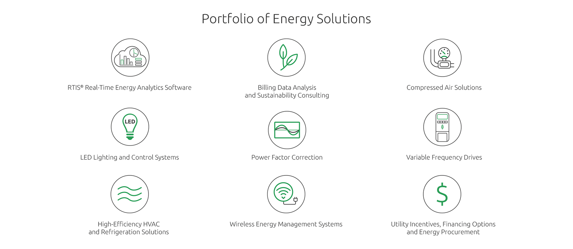
A clean and consistent design system was achieved through the application of custom secondary branding design elements. I executed a system of deliverables across multiple channels.
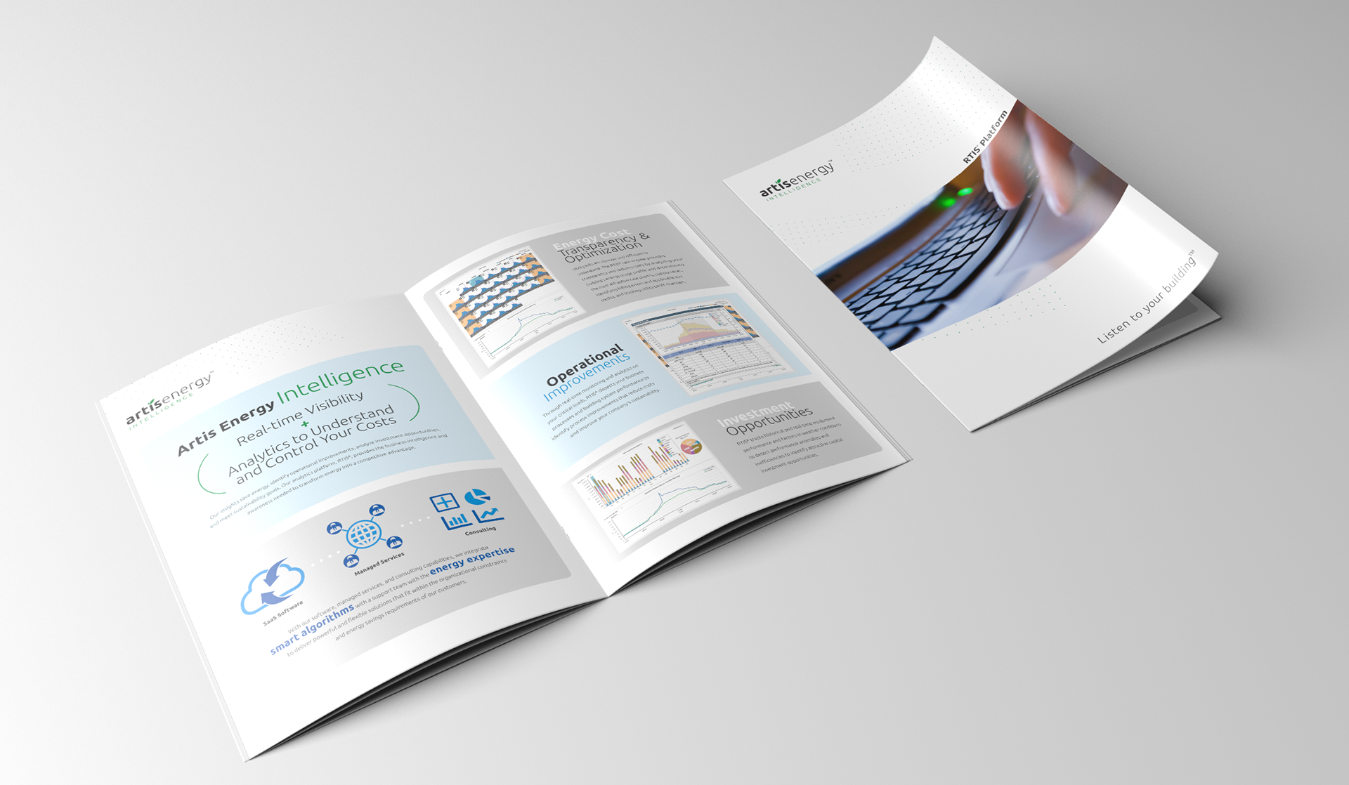
Artis Energy RTIS platform brochure
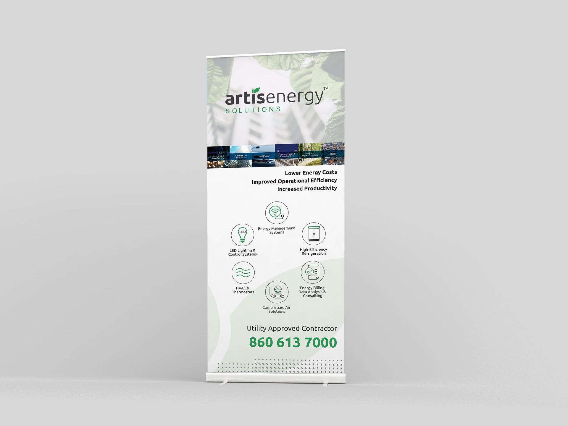
Event signage rollup

Series of corporate brochures
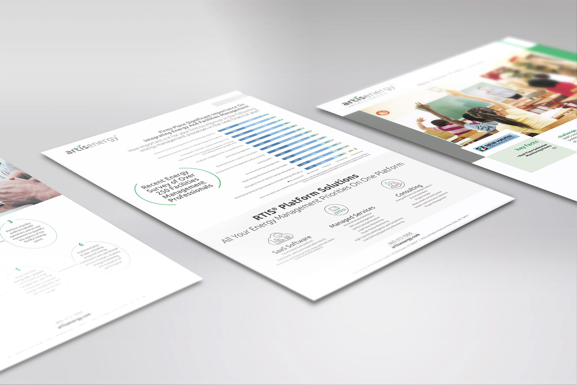
Fact sheets