
Case Study
The Product
A biannual film festival with users between 24–55 years old. Most users are young directors eager to get their projects noticed by a world audience.
The Challenge
Most film festival sites have a difficult to use submission process.
The Goal
Infilmas goal is to be very user-friendly especially for budding directors as they submit their work for consideration.
Summary
I discovered that many target users are initially excited about the work product they have completed. However when it becomes time to find a film festival with an open call they can be overwhelming and confusing to navigate.
Pain Points
• “Navigation”: Film festival websites often have a submission process that is overwhelming and difficult to use.
• “Interaction”: Tucked away submission links and buttons make this difficult, which sometimes leads users to make mistakes.
• “Experience”: The film festival submission process does not provide an engaging browsing experience.
• “Interaction”: Tucked away submission links and buttons make this difficult, which sometimes leads users to make mistakes.
• “Experience”: The film festival submission process does not provide an engaging browsing experience.
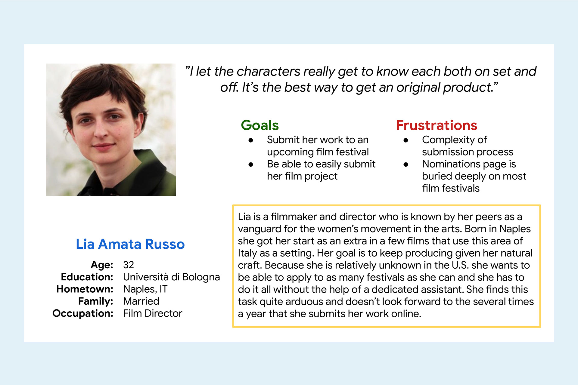
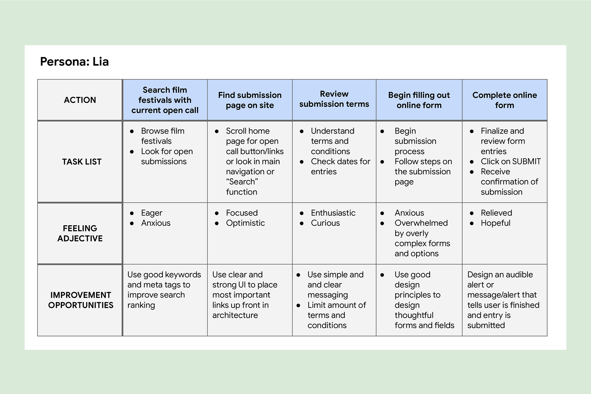
User persona
Empathy map
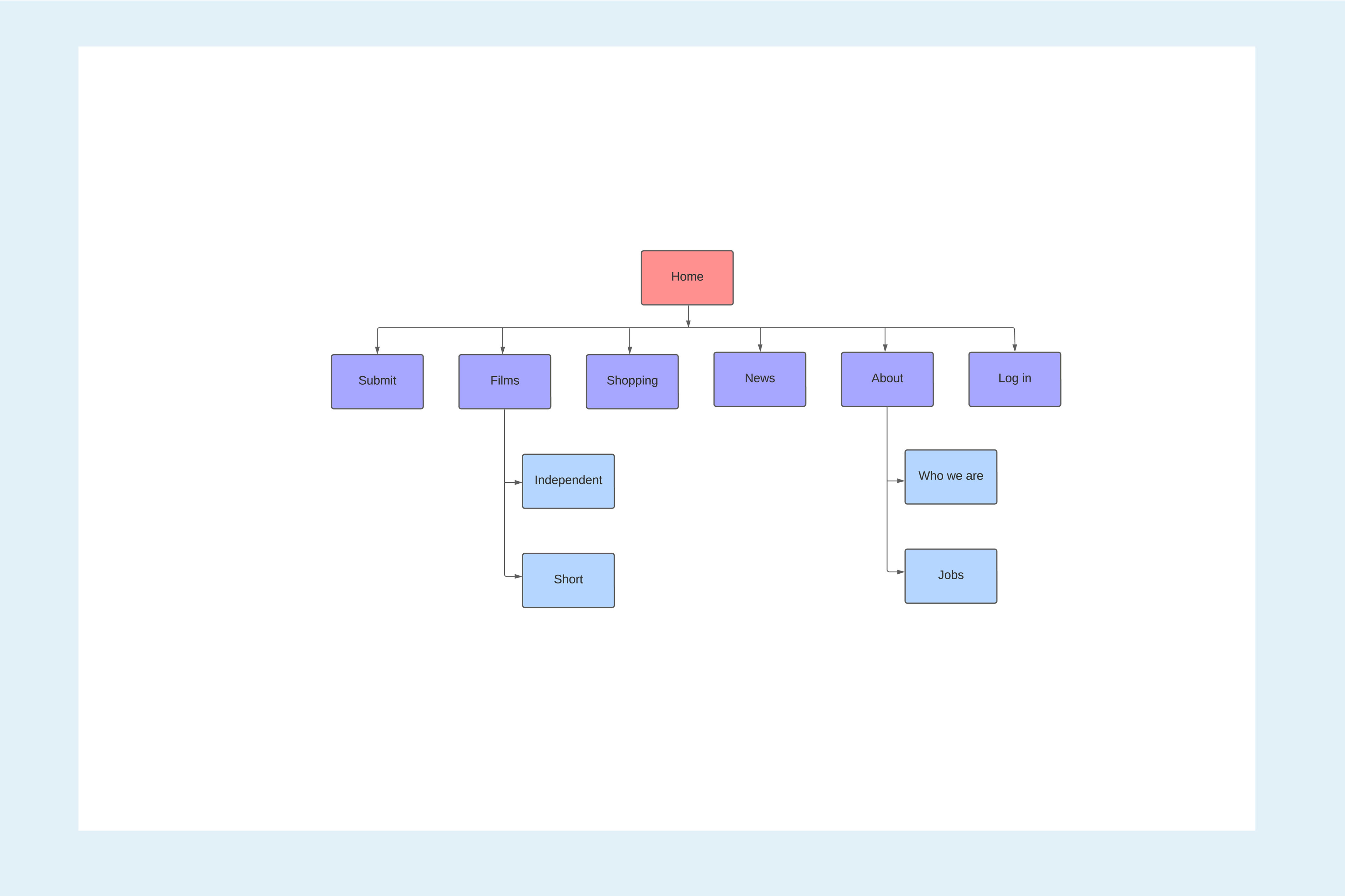
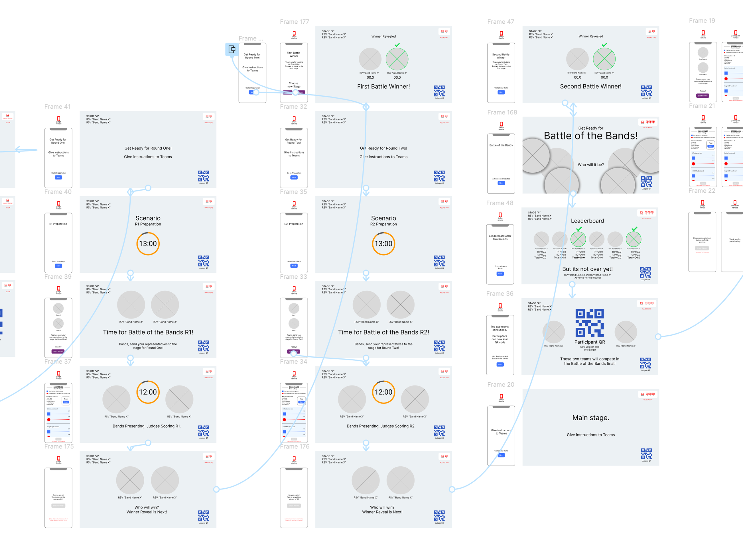
Sitemap
Sitemap
Difficulty finding the submission page was a primary pain point for users, so I used that knowledge to create a sitemap. My goal here was to make strategic information architecture decisions that would improve overall website navigation. The structure I chose was designed to make things simple and easy.
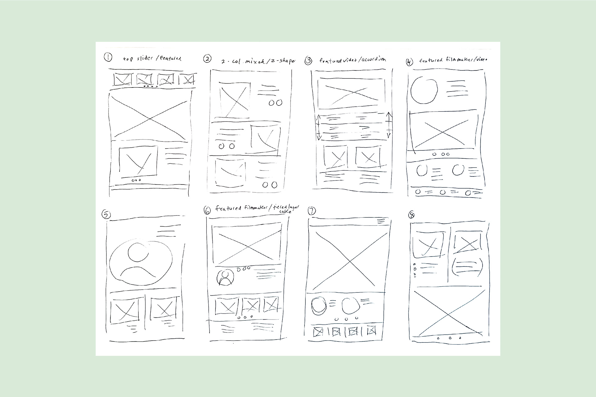
“Crazy 8s” hand sketched wireframe
“Crazy 8s”
I sketched out paper wireframes starting with a “Crazy-8s” exercise, keeping the user pain points about navigation and browsing in mind. Then I moved to a quick series of sketches eventually coming up a refined structure for the next stage.
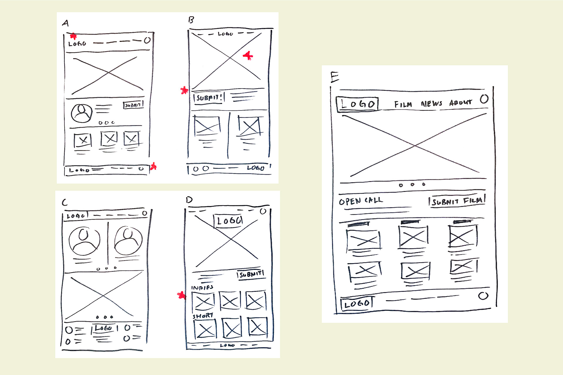
Paper wireframes phase two
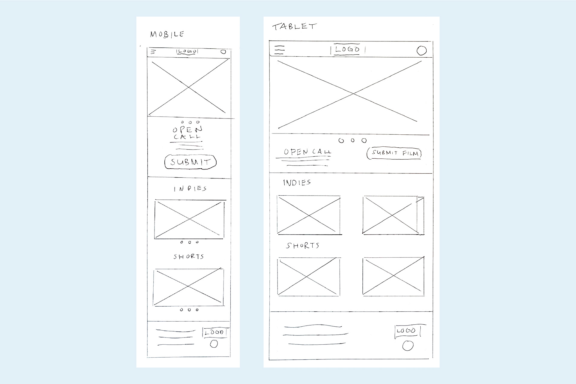
Screen size variations
Paper Wireframing
Moving onto the 2nd phase of sketching by hand I came up with several options. Next I added a series of red stars onto elements of the sketch which I deemed good ideas and that would be used on the following phase of digital wireframes.
Digital Wireframes
Moving from paper to digital wireframes made it easy to understand how the redesign could help address user pain points and improve the user experience. Prioritizing useful button locations and visual elements on the home page was a key part of my strategy.

Low fidelity prototype. Go to Prototype >
Prototyping Phase
To create a low-fidelity prototype, I connected all of the screens involved in the primary user flow. At this point, I had received feedback from other participants in the course about things like placement of buttons and page organization. I made sure to listen to their feedback, and I implemented several suggestions in places that addressed user pain points.

Design and Mockups
Based on some of my insights I made changes to improve the site’s flow (below). One of the changes I made was adding a secondary navigation dedicated to the primary users journey—being able to directly find and navigate to the film categories of the festival. This allowed users easier access to the main page of the site.
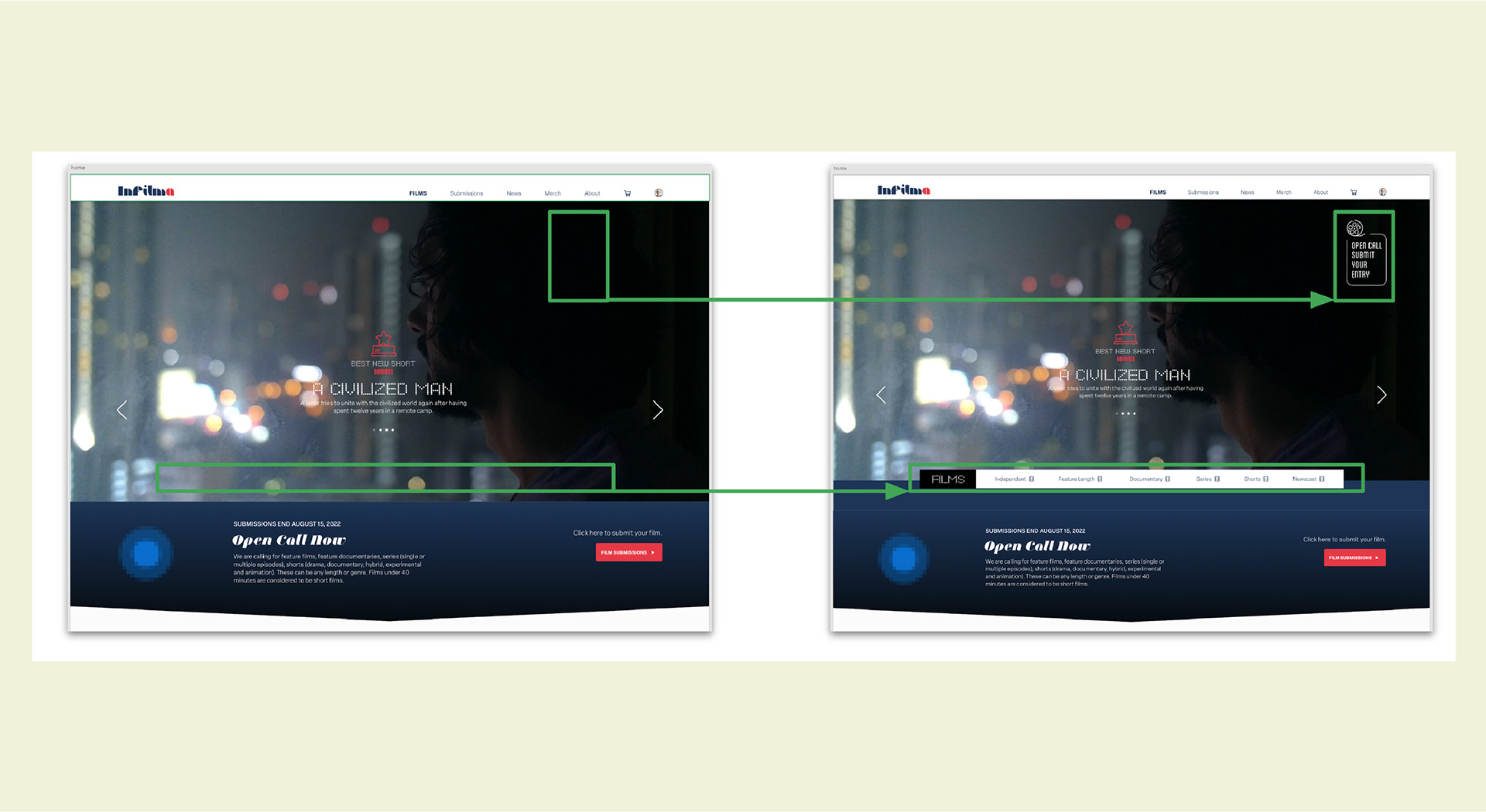
Refining key user pain points
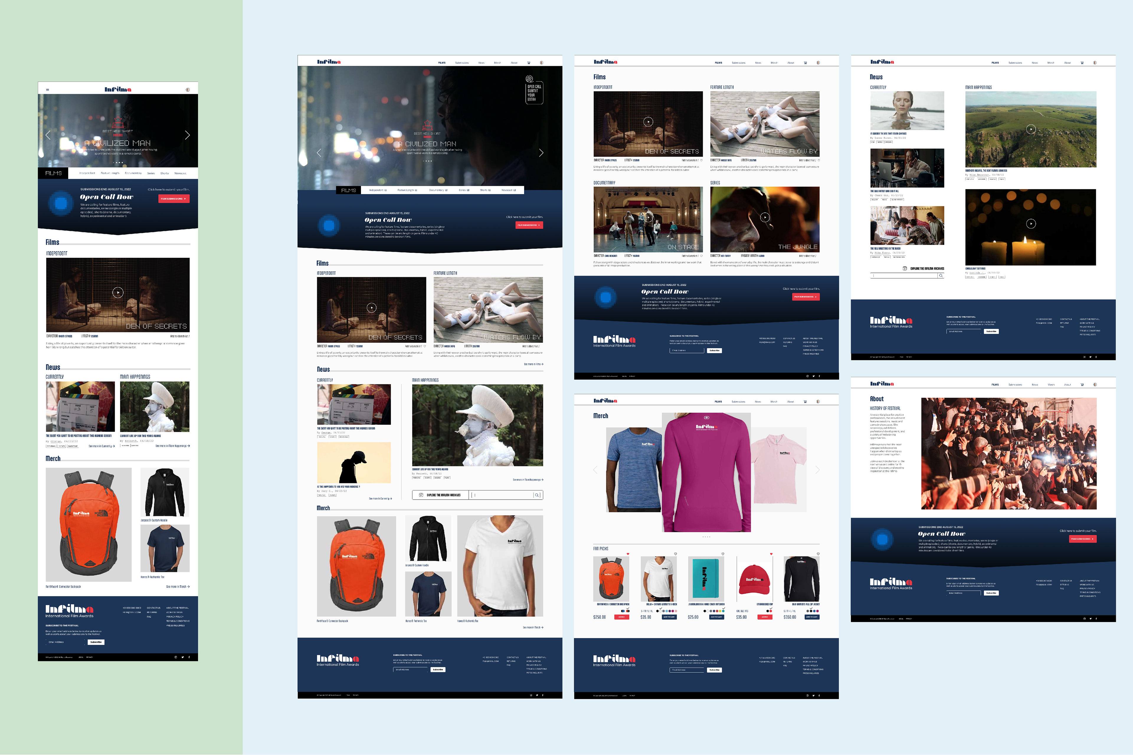
Mockups in tablet (left) and desktop experience (right)
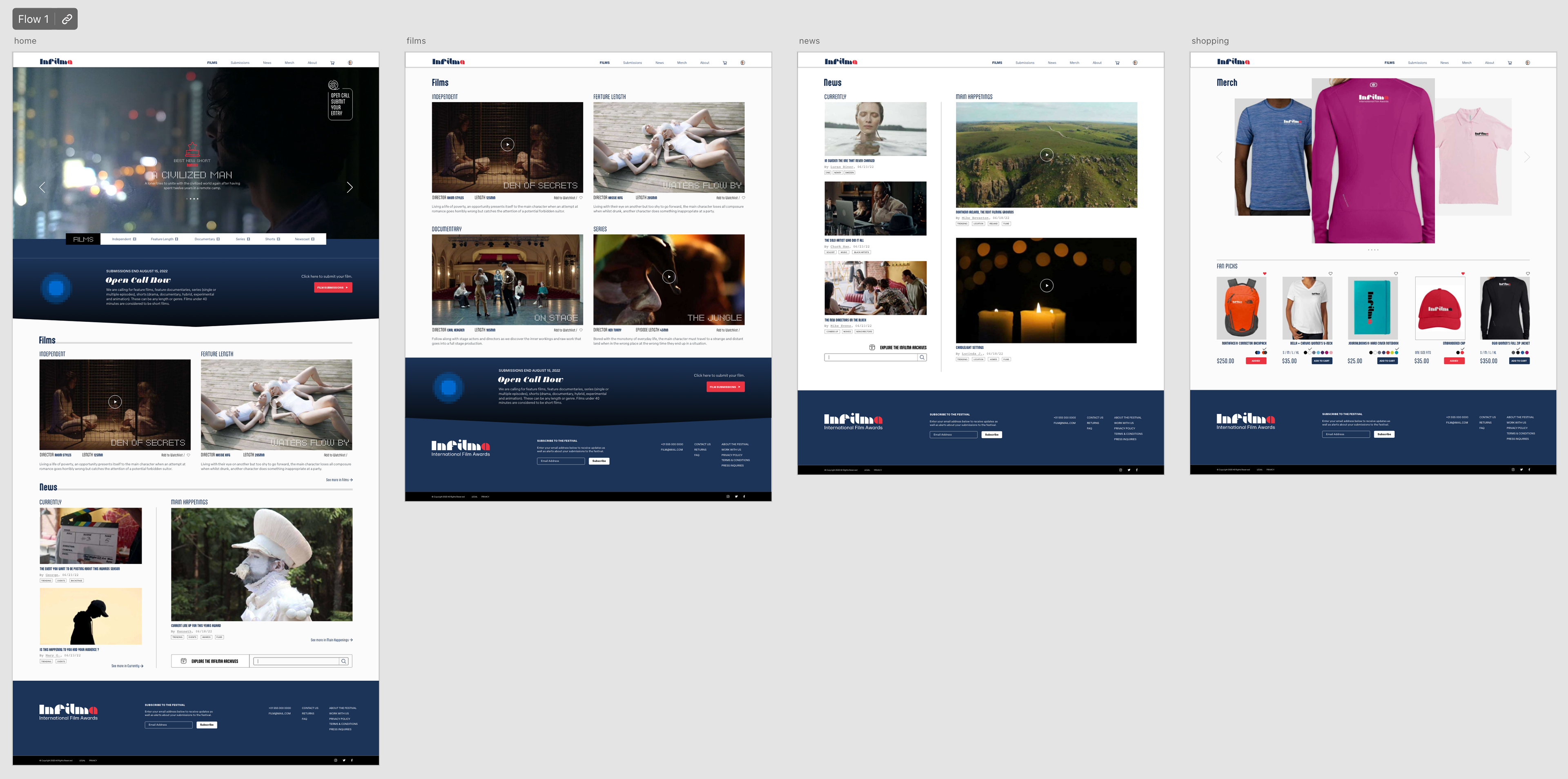
Final high fidelity prototype. Go to Prototype >
Impact
Our target users shared that the design was intuitive to navigate through and demonstrated a clear visual hierarchy.
What I learned
I learned that even a small design change can have a huge impact on the user experience. The most important takeaway for me is to always focus on the real needs of the user when coming up with design ideas and solutions.
Next steps
• Conduct follow-up usability testing on the new website
• Identify any additional areas of need and ideate on new features
• Continue adding new content and site pages using sticker style guide and grids
• Identify any additional areas of need and ideate on new features
• Continue adding new content and site pages using sticker style guide and grids
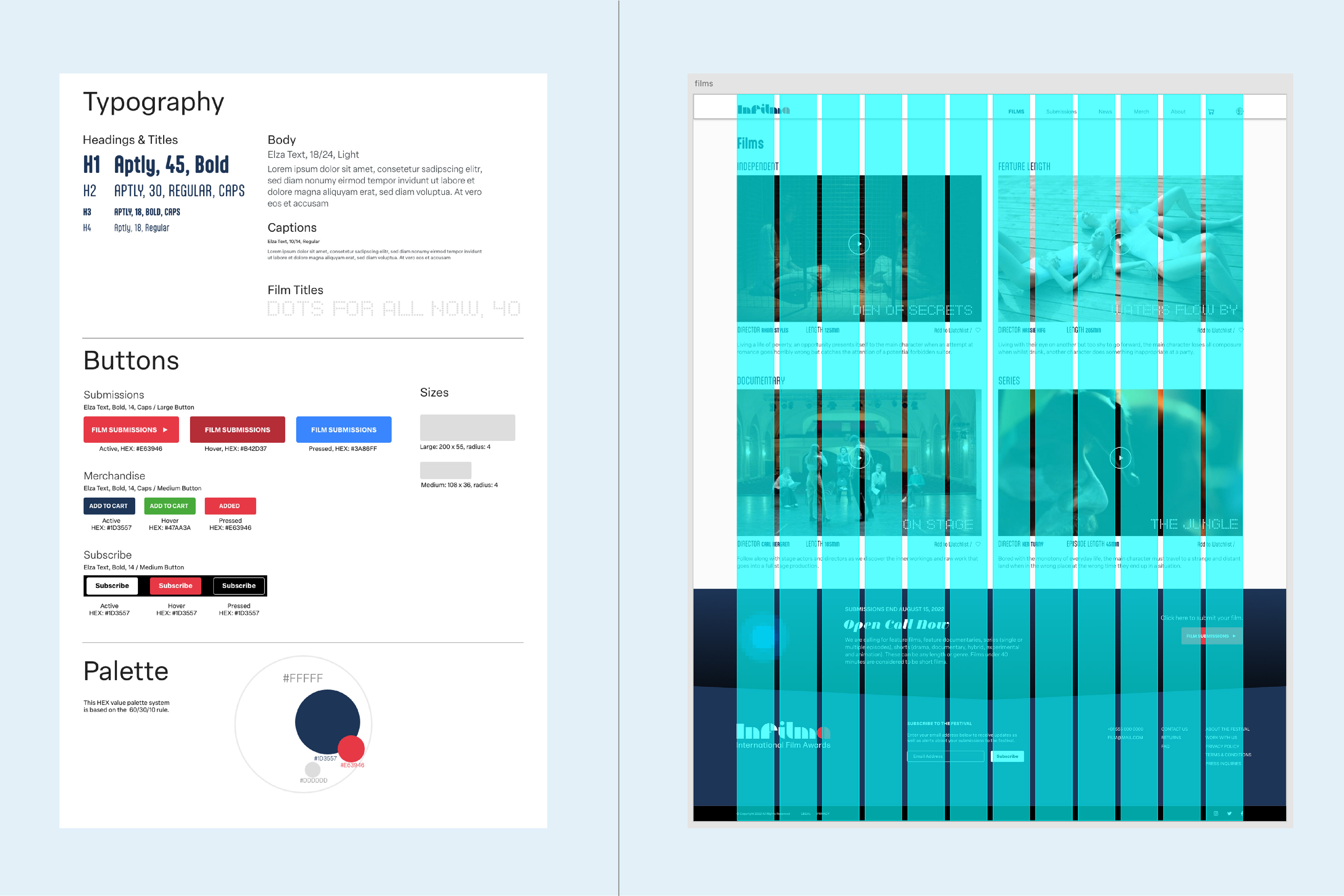
Style sheet (left), 12 column grid (right)

