
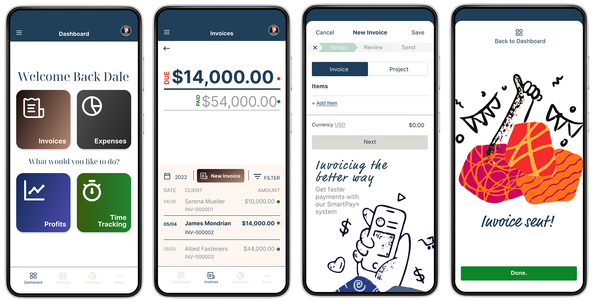
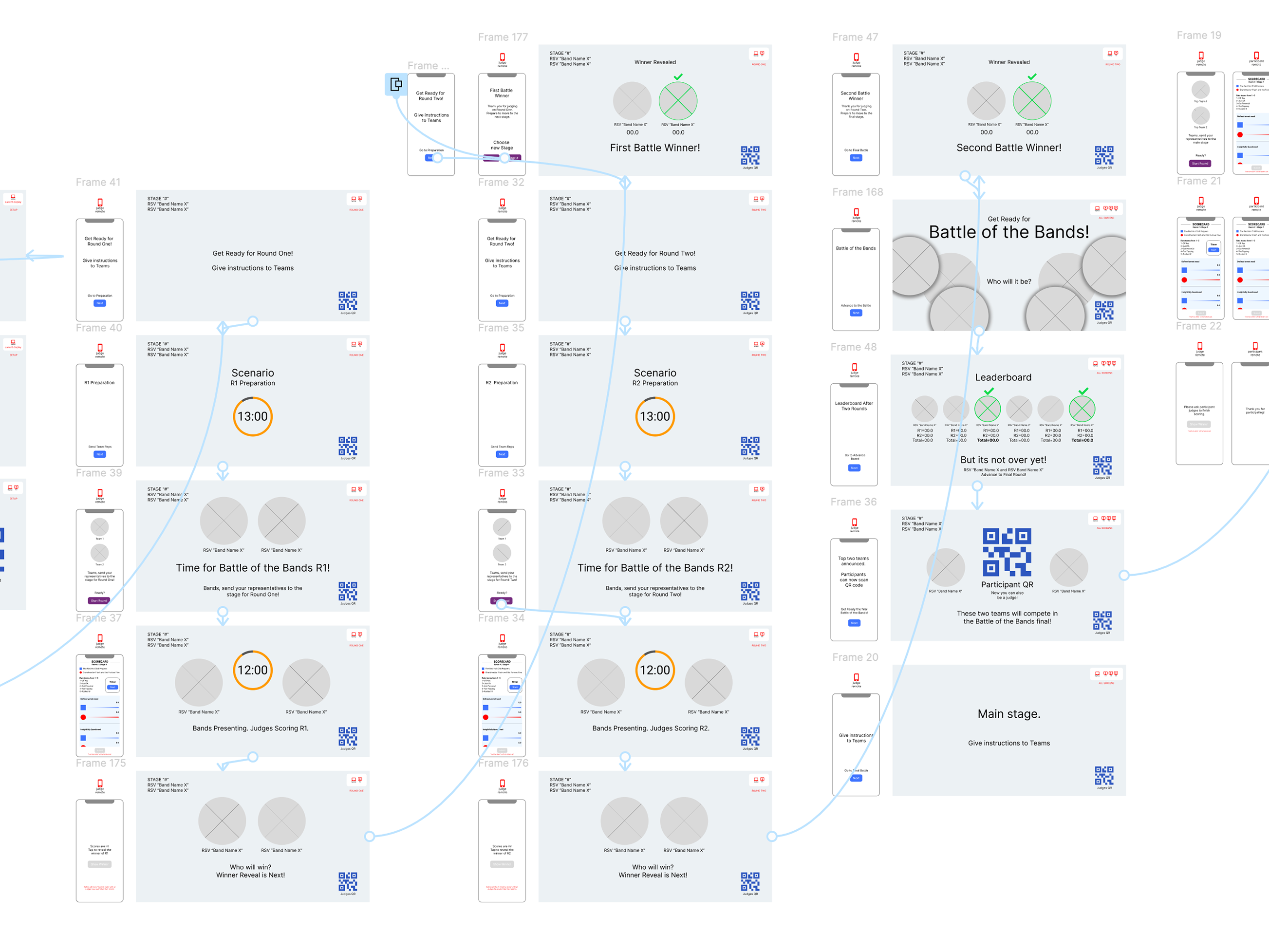
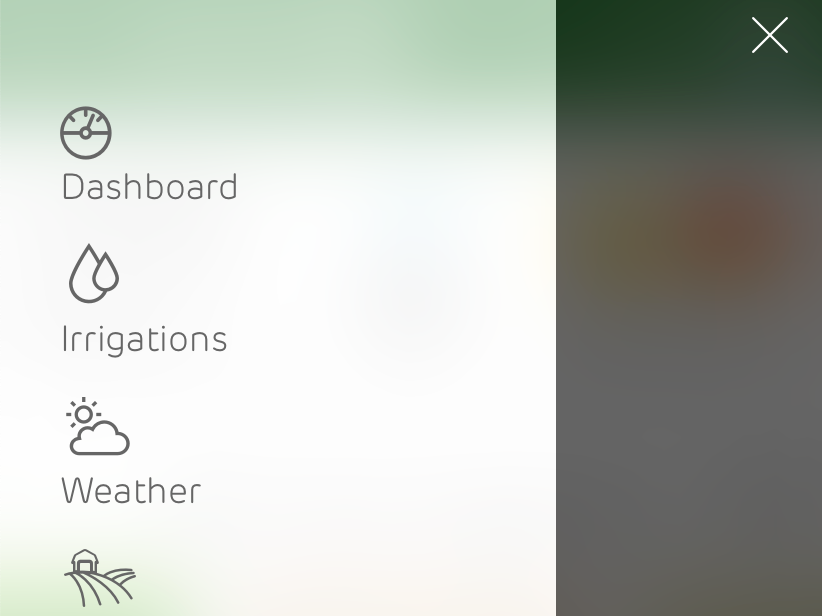
Native App Mockup
Sample wireframes for desktop and mobile experience (SaaS)
• Here are 4 of the 12 main screens that needed to be wireframed pulling directly from the IA mapping work
• Rapid prototyping for the full desktop experience of the SaaS system
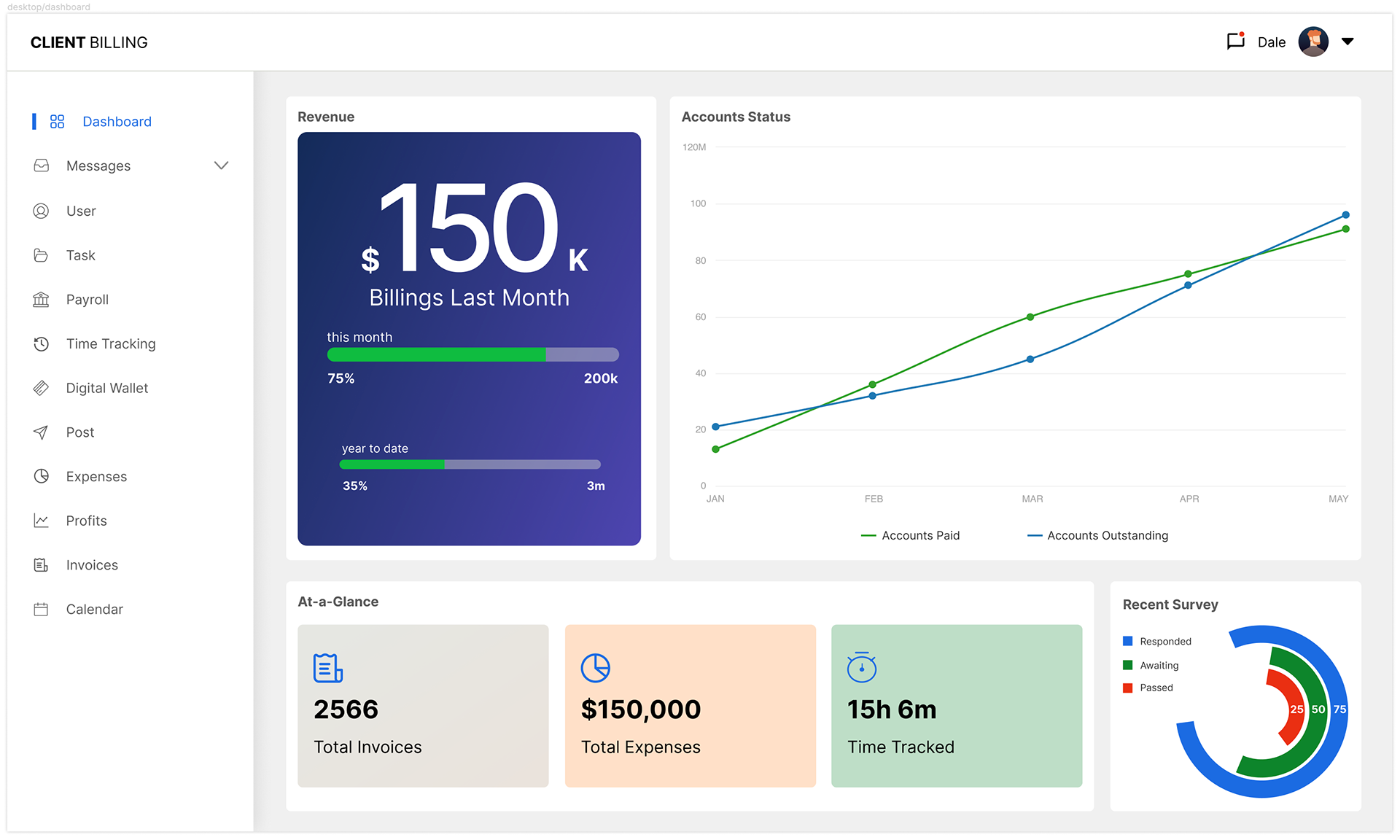
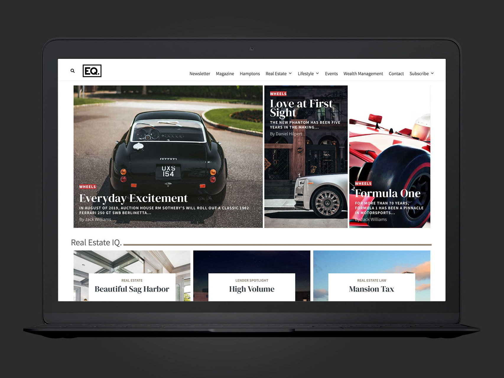
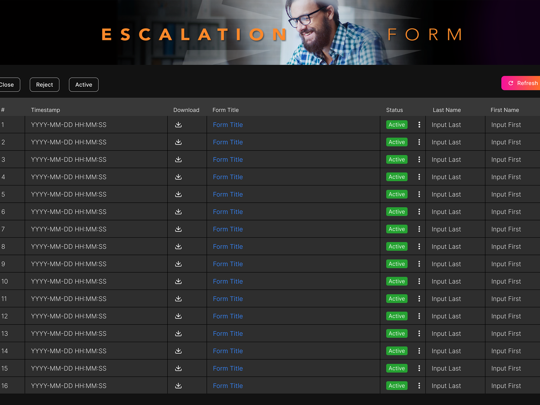
Desktop Experience Mockup (dashboard, flow start)
Case Study
The Challenge
This project attempts to create an easy to use client billing app that a user can navigate through to perform several critical billing and financial functions.
The Goal
The goal in the end is to demonstrate to a potential user/client that this app would be easy to use and complement their most important business cash flow procedures.

Summary
I began with creating two personas: “Dale” and “Indira”. Dales persona is from the perspective of someone who manages a billing/accounts office. In the case of “Indira” she is someone who may not be as senior as Dale in this field however she still represents a persona to gain valuable insight from as the empathy process unfolds. From the data and insight I was able to gain I proceeded creating a typical user flow. This flow directly informed the most important user needs and potential pain points. The next process was to create a series of wireframes and low fidelity mockups in Figma.
Pain Points
• “Language Barriers”: Understanding that this product will be used by international users the choice of iconography and color will be a crucial design factor.
• “Navigation”: In order for users to successfully navigate this product it will be necessary to perform usability studies.
• “Relevant Functions”: Because this product must be able to perform critical functions specific to a billing/accounting office it is important to do thorough competitive audits to gain a proper understanding of relevant industry needs.
• “Accessibility Concerns”: This product must be accessible to users with different physical impairments.
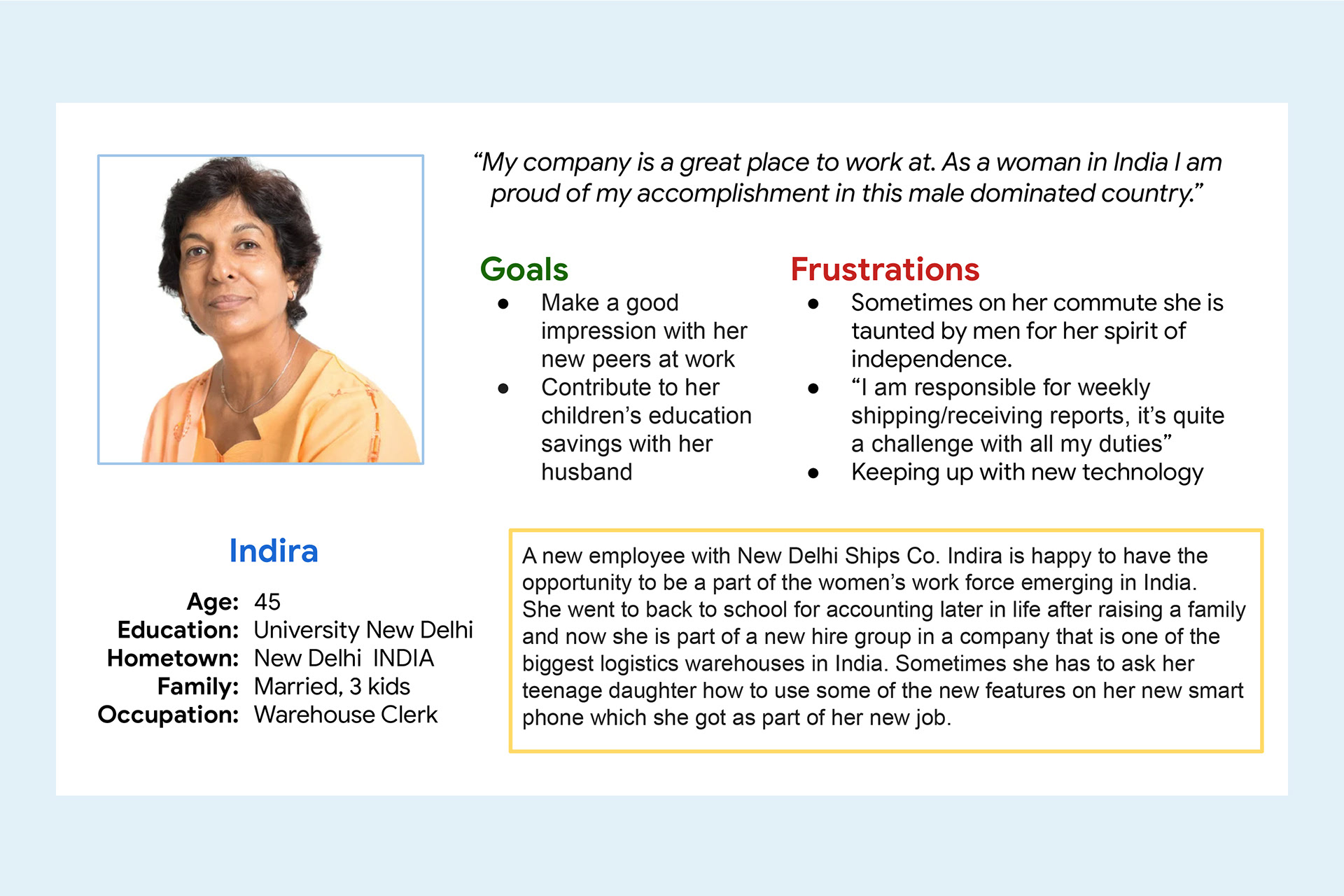
User persona “Indira”
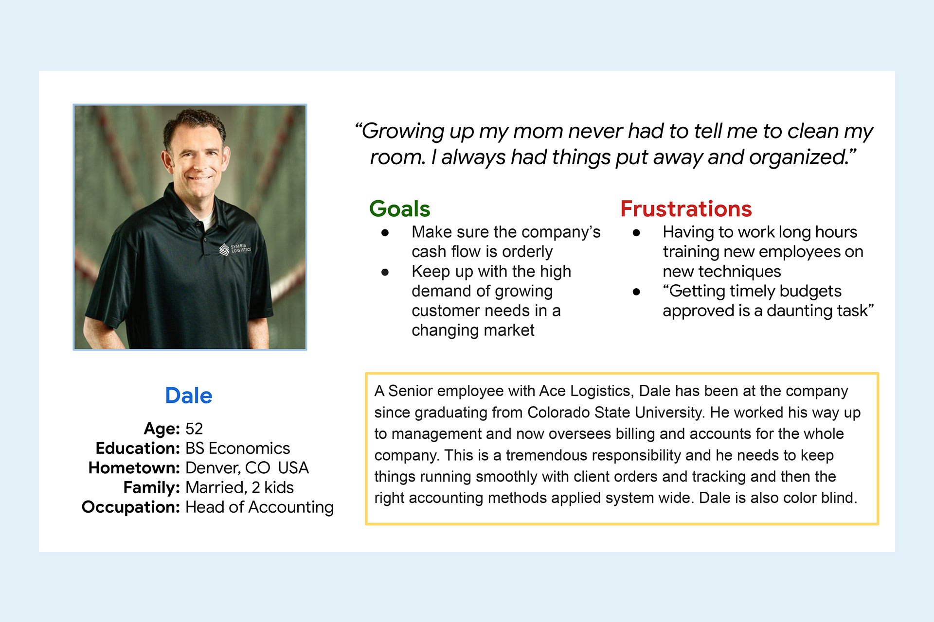
User persona “Dale”
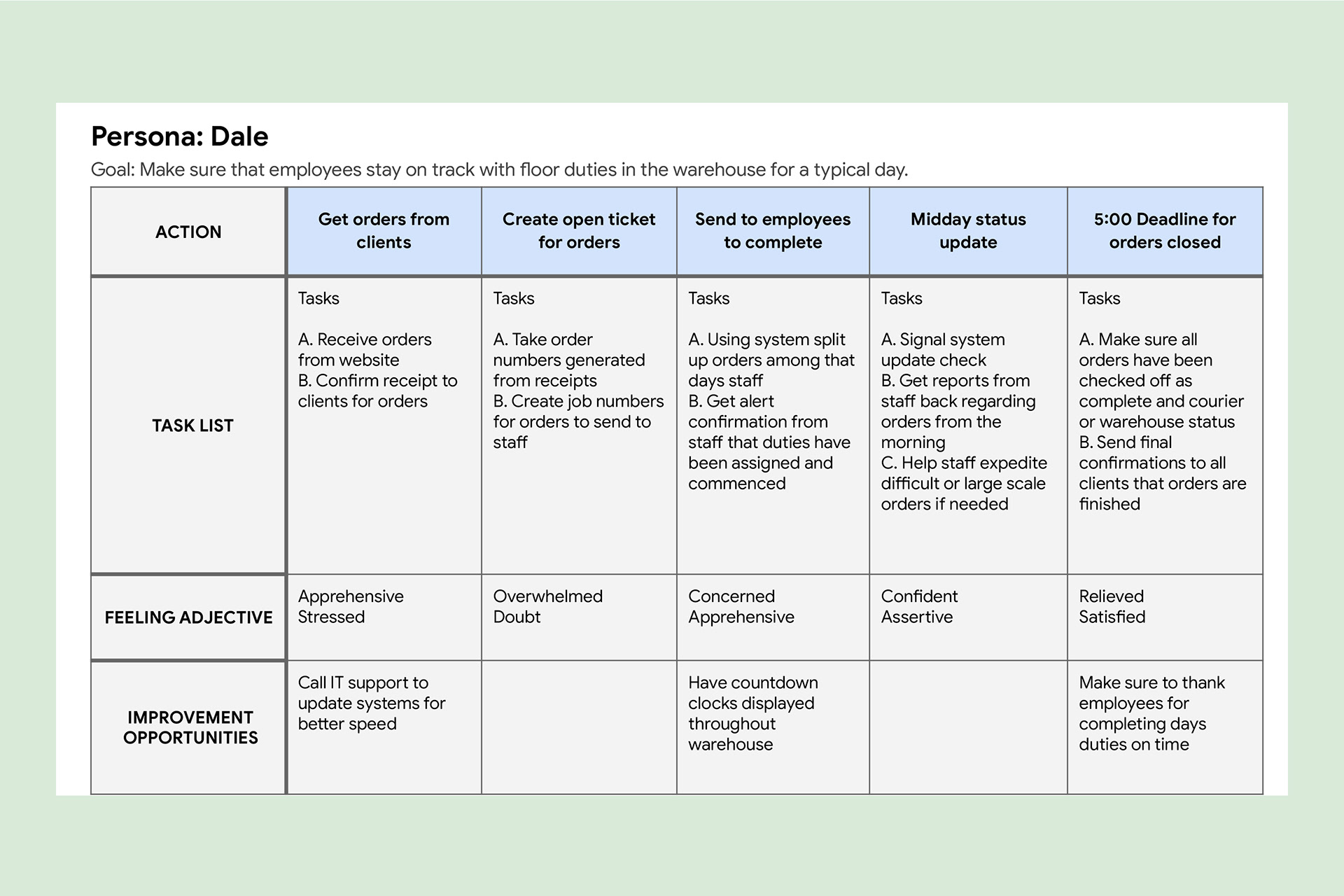
User “Dale” journey map
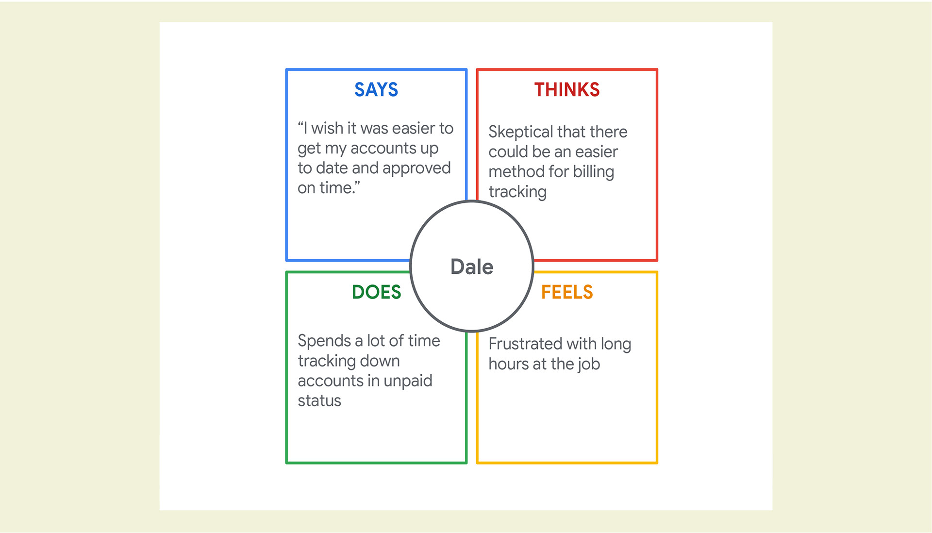
Empathy Map
I created an empathy map based on what I had learned about our user Dale so far. According to what he said, thought, did and felt I was able to get a good picture for the next stage of development.

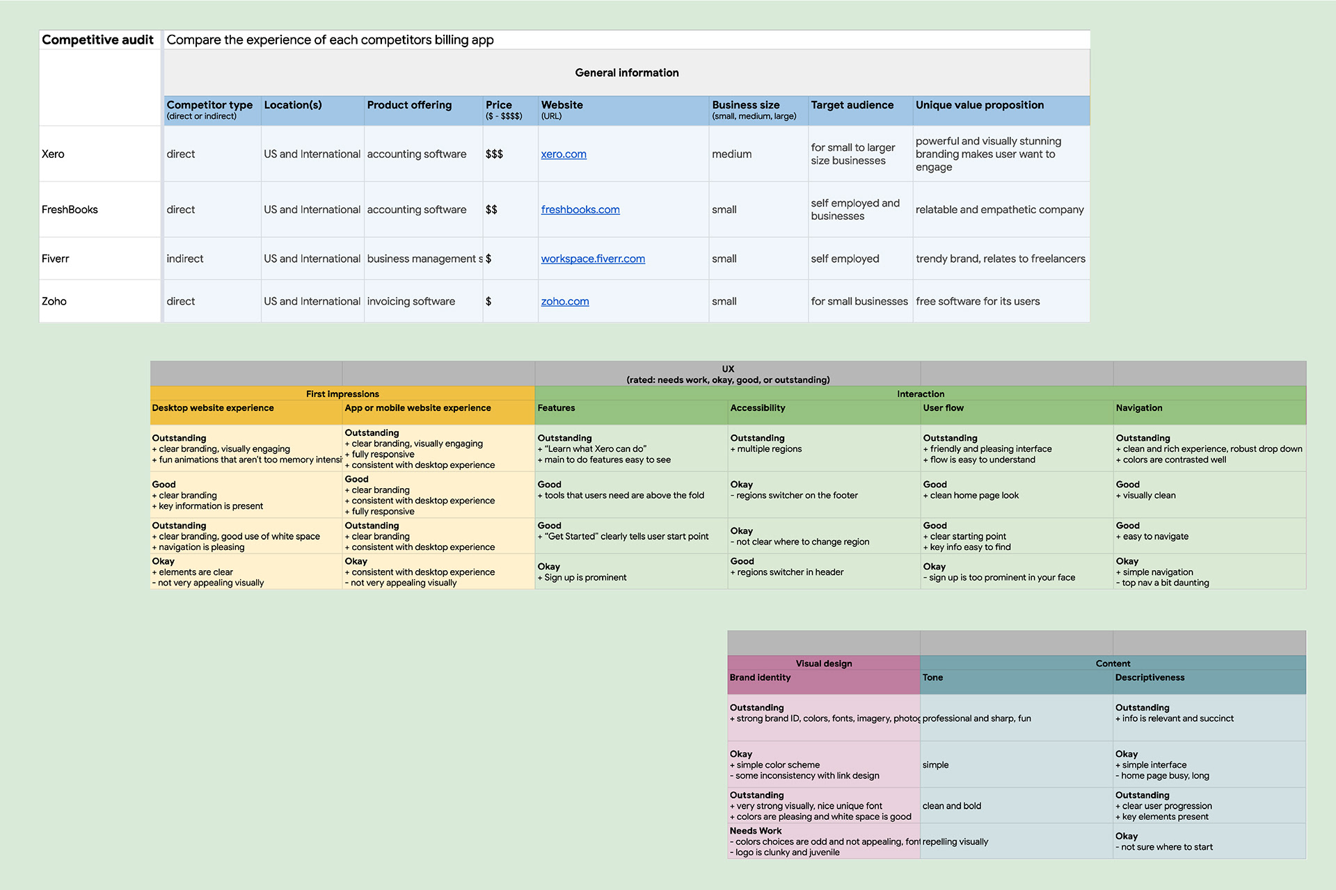
Competitive analysis matrix
Competitive Analysis
Using a large matrix table I set up in Google sheets I went ahead and began studies of four industry competitors. Three direct and and one indirect competitor were analysed and documented on several factors including, product offerings, target audience, unique value proposition as well as visual branding and identity details. All of this research is critical in comparing and contrasting what details and options could be introduced into the app that could set it apart.
Storyboards and App Flow
My next task was to come up with a couple of scenarios using storyboards to get a better idea of what a possible user journey could look like as its drawn out.
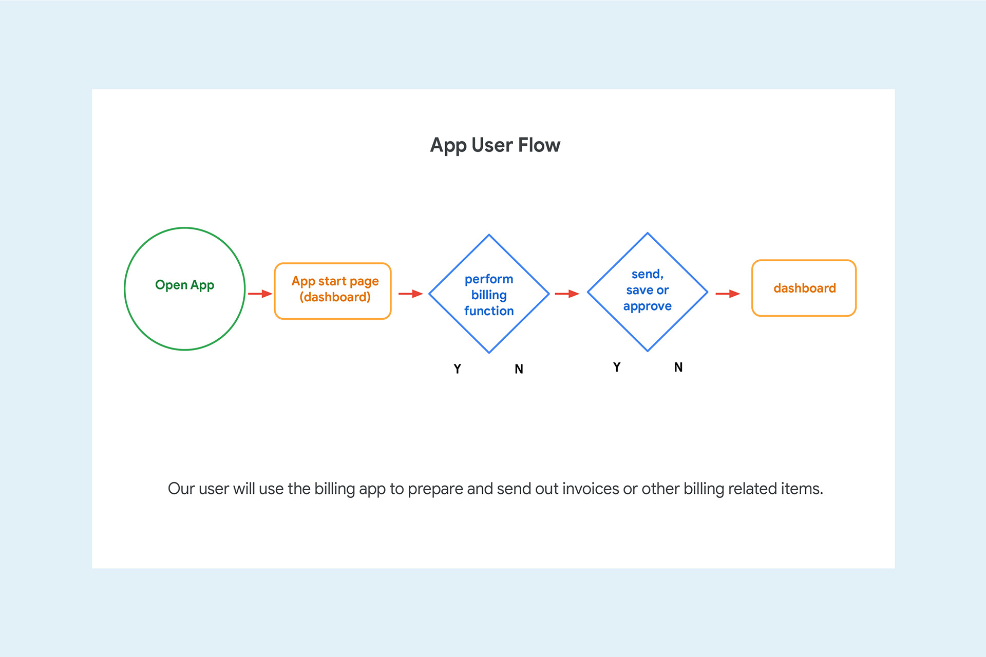
User flow study
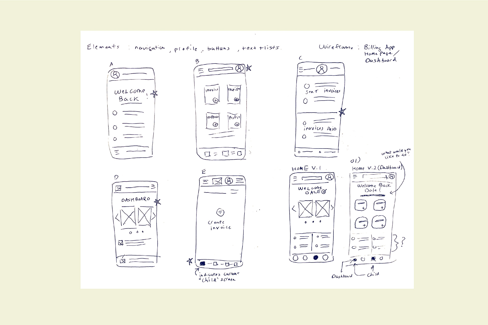
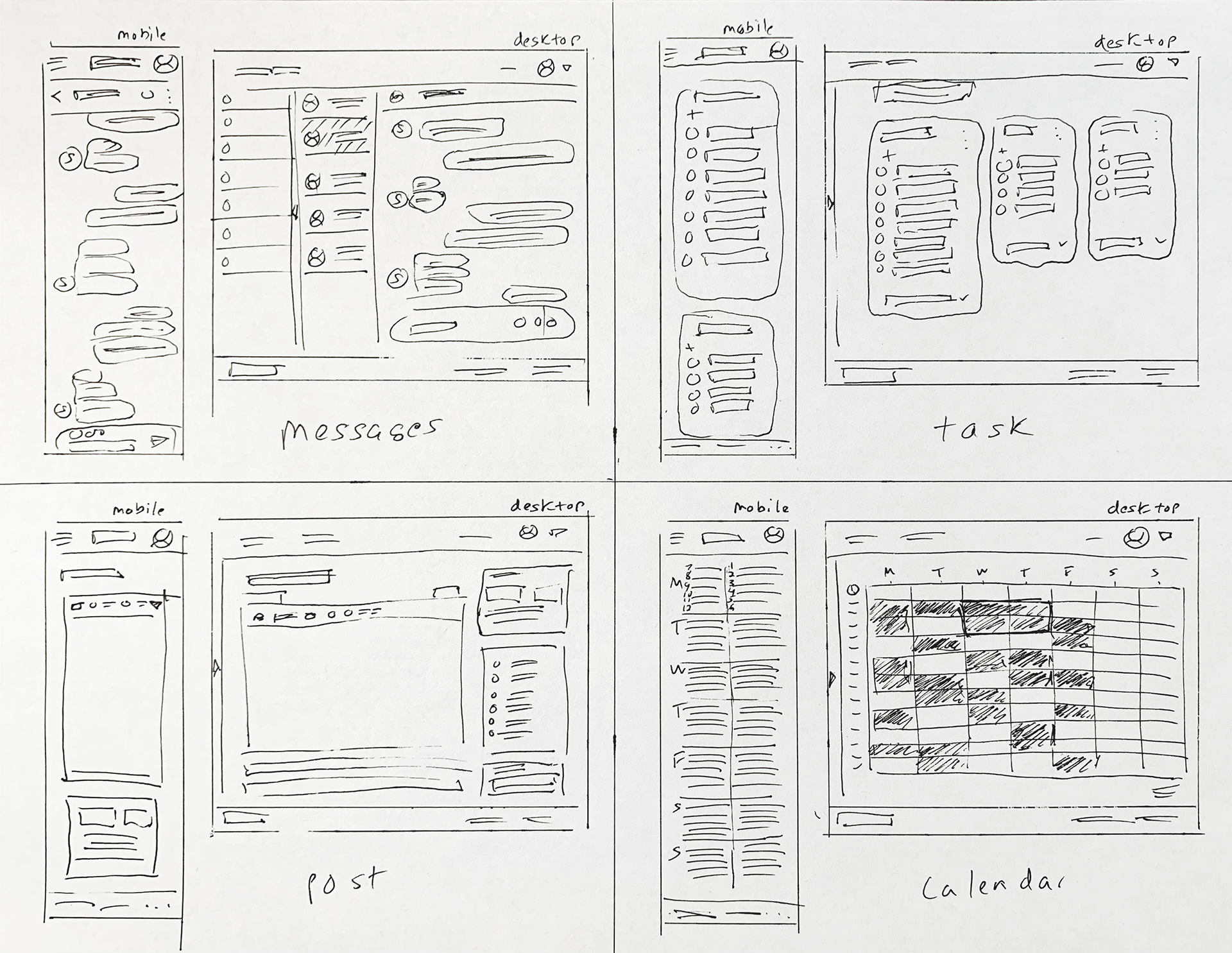
Paper wireframes
Wireframing
After some quick sketching of paper wireframes I quickly moved to drafting up digital wireframes in Figma.
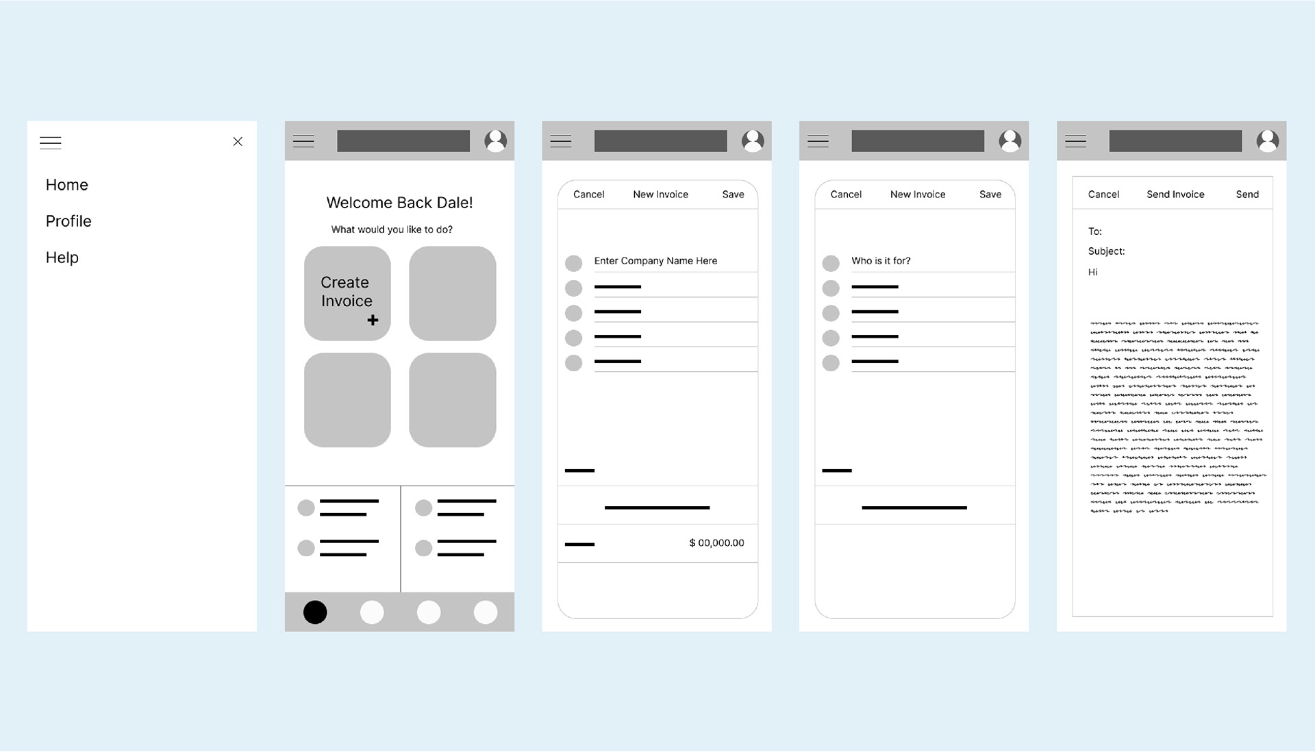
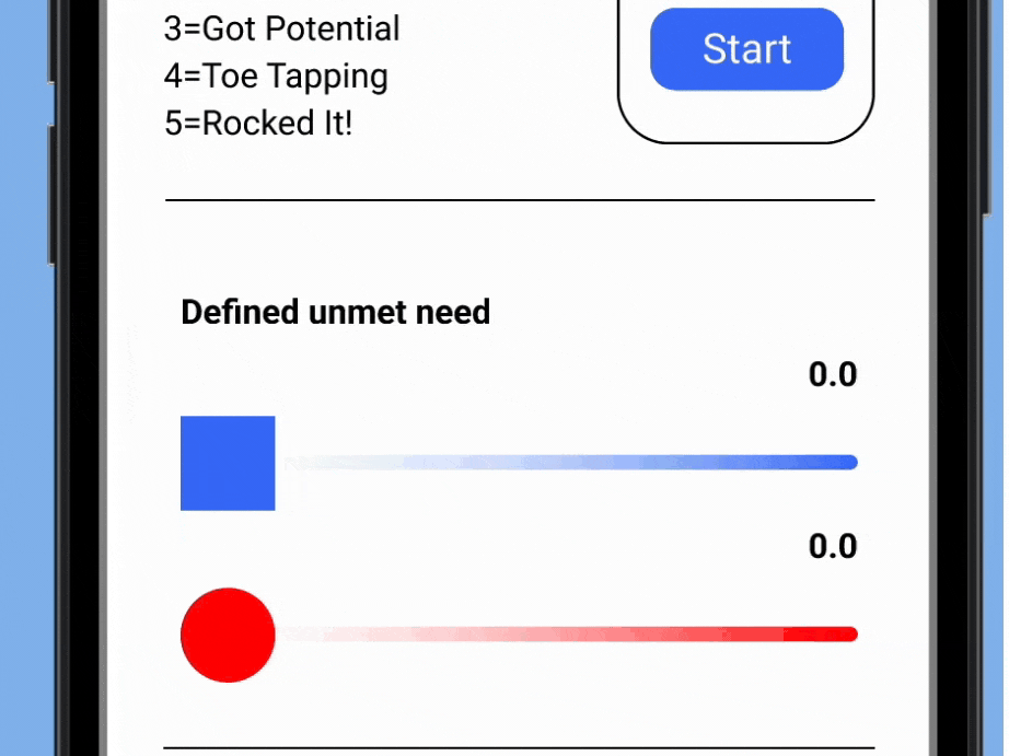
Digital wireframes
Digital Wireframes
Moving from paper to digital wireframes made it easy to understand how the design could help address user pain points and improve the user experience. Prioritizing useful button locations and visual elements on the home screen was a key part of my strategy.
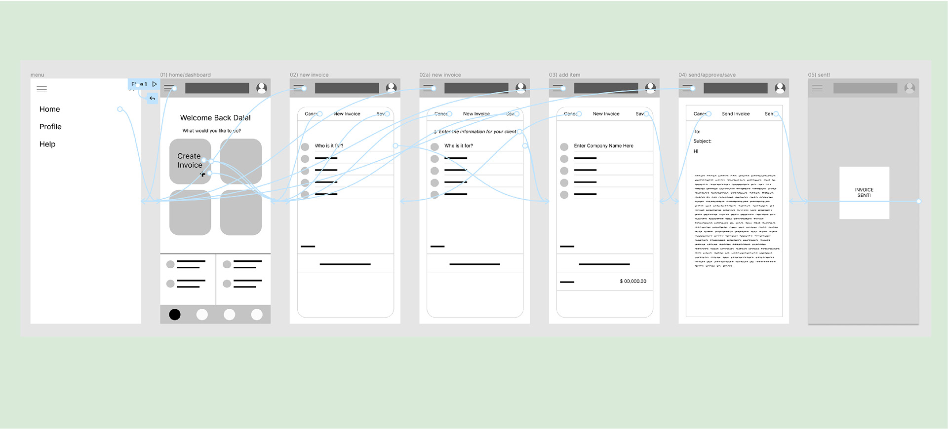
Low fidelity prototype. Go to Prototype >
Prototyping Phase
To create a low-fidelity prototype, I connected all of the screens involved in the primary user flow. At this point, I had received feedback about things like placement of buttons and screen organization. Then I implemented several suggestions in places that addressed user pain points.
Usability Study Findings
The following insights were gained from an unmoderated user study of 5 participants.
• Users struggled at the 2nd screen
• Some of the labeling was unclear
• Only 1 out 5 participants had an easy time navigating through the flow
• Some confusion was revealed on how to navigate back from a screen
• A function of one of the icons was not clear
• Some of the labeling was unclear
• Only 1 out 5 participants had an easy time navigating through the flow
• Some confusion was revealed on how to navigate back from a screen
• A function of one of the icons was not clear
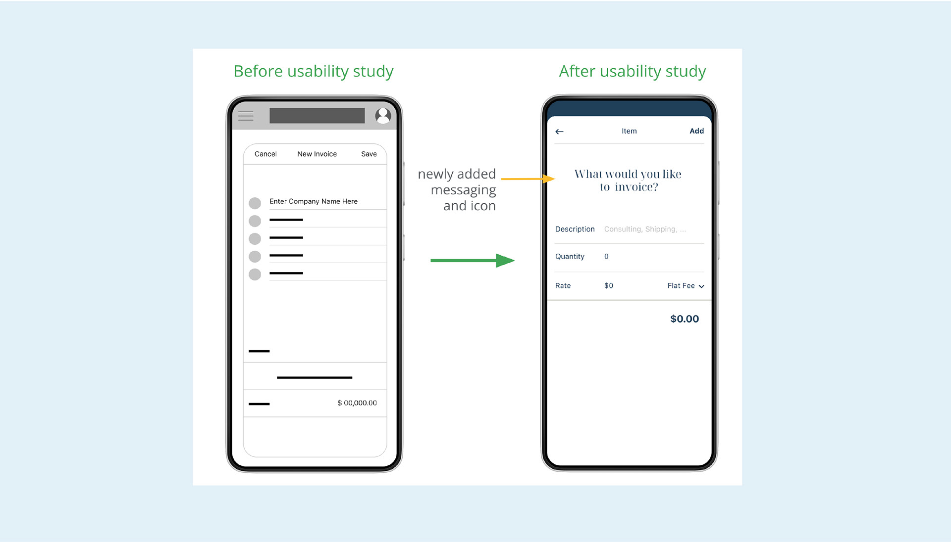
Design revision after usability finding
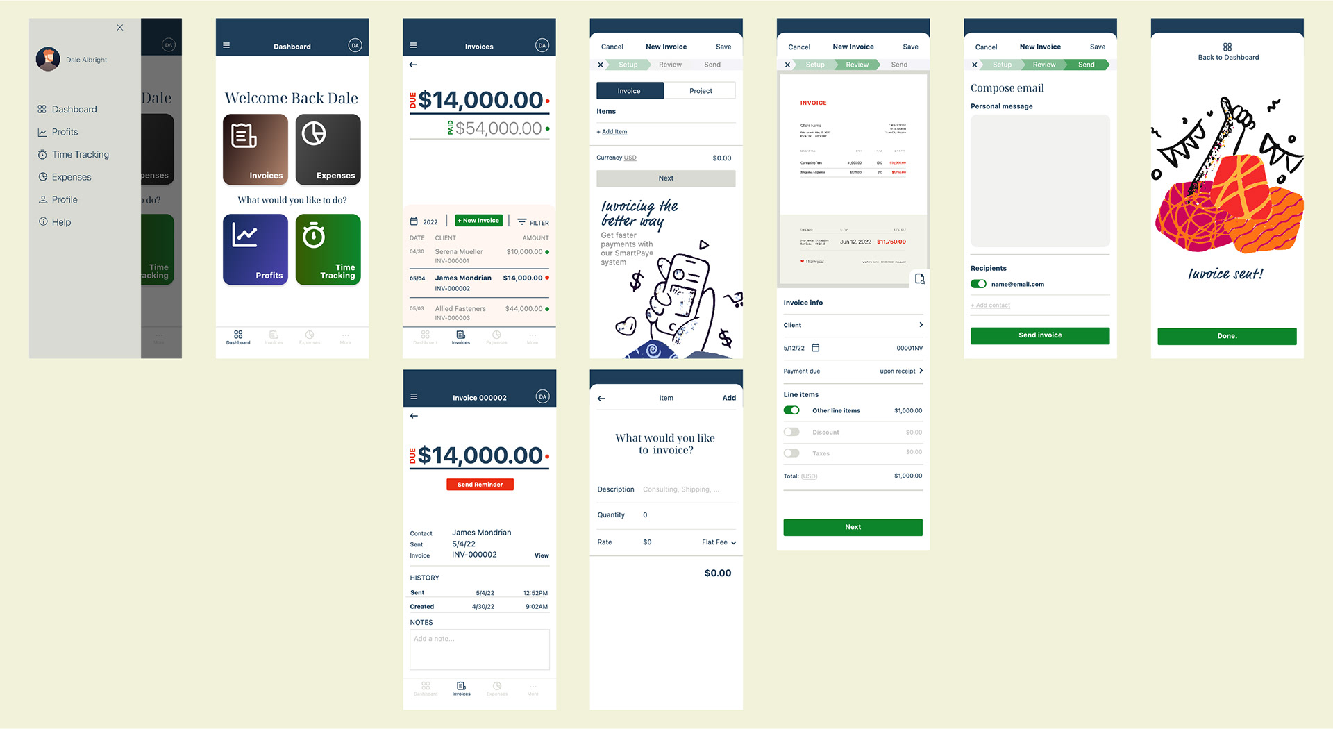
High fidelity mockups in Figma. Go to Prototype >
Accessibility Considerations
• Choice of iconography will be crucial because different cultures have varying values as they pertain to certain symbols
• Color choices and palettes must be weighed and informed by the WCAG set of standards for maximum readability
• Each critical navigation element must have clear text that states a purpose for people with visual impairments
• Color choices and palettes must be weighed and informed by the WCAG set of standards for maximum readability
• Each critical navigation element must have clear text that states a purpose for people with visual impairments
Next steps
• Conduct follow-up usability testing on the new app
• Identify any additional areas of need and ideate on new features
• Continue adding new content and screens using sticker style guide and grids
• Identify any additional areas of need and ideate on new features
• Continue adding new content and screens using sticker style guide and grids
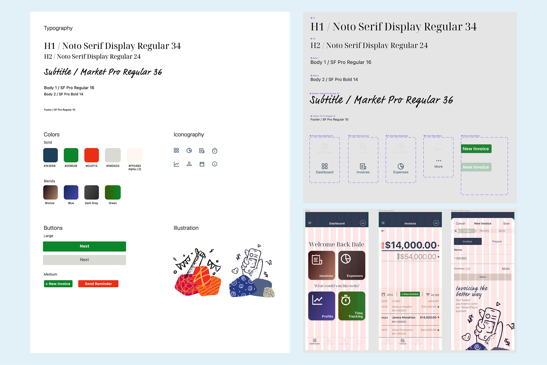
Sticker sheet (left), Figma components and grid considerations (right)
